 Start a project →Start a project →
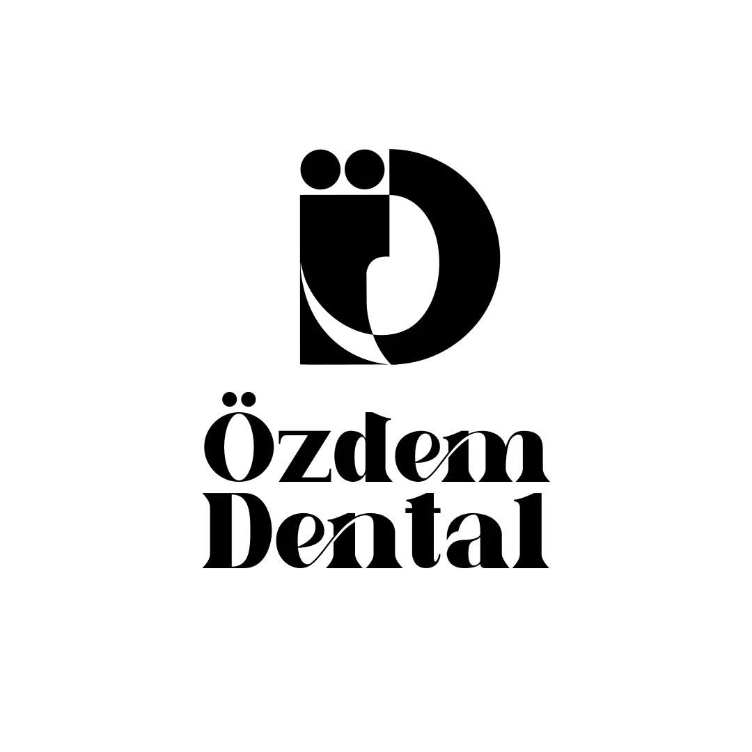
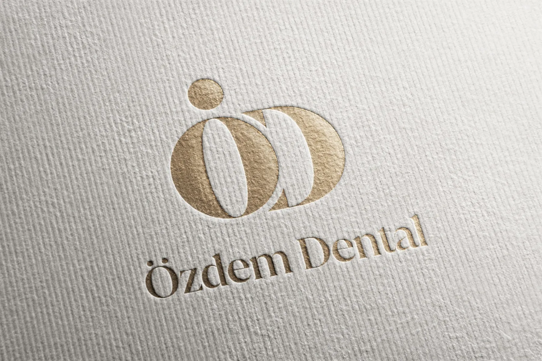
We built a brand from two letters for a newly opened polyclinic in Kapaklı. Ö and D became a single illuminated form, repeating with the same calm everywhere, from business cards to bags, from the catalogue to the website.
In a growing district like Kapaklı, a new clinic has to promise “big-city quality” at first glance.
We started with a short survey of the clinic owner and dentists: how they see themselves, and how they want patients to see them. Then we explored more than thirty very different logo directions and distilled them into a single idea.
A gold-toned, high-contrast ÖD monogram. A complete identity set, from print and uniforms to stationery and the website, plus a professional photo shoot of the clinic.
Tooth silhouette, smile curve, flowing wave, geometric monogram… We presented the clinic with nineteen very different logo directions. Every direction we dropped taught us something: for Özdem, the tooth icon was too ordinary, bright colours too childish, the wave too busy. Two letters were left.
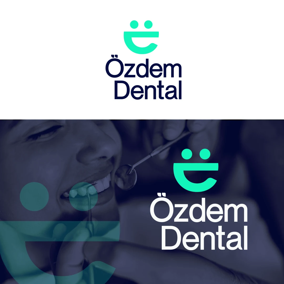
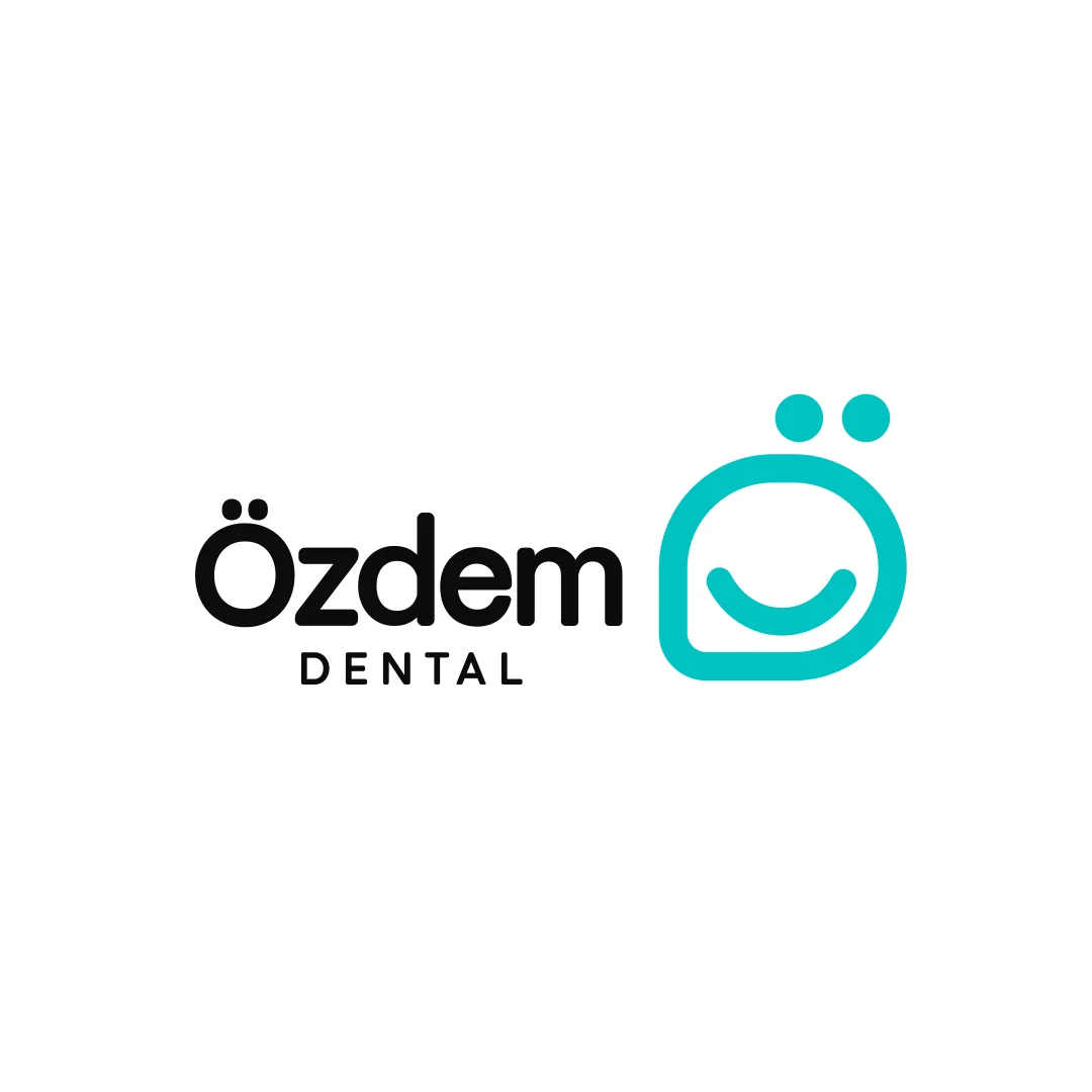
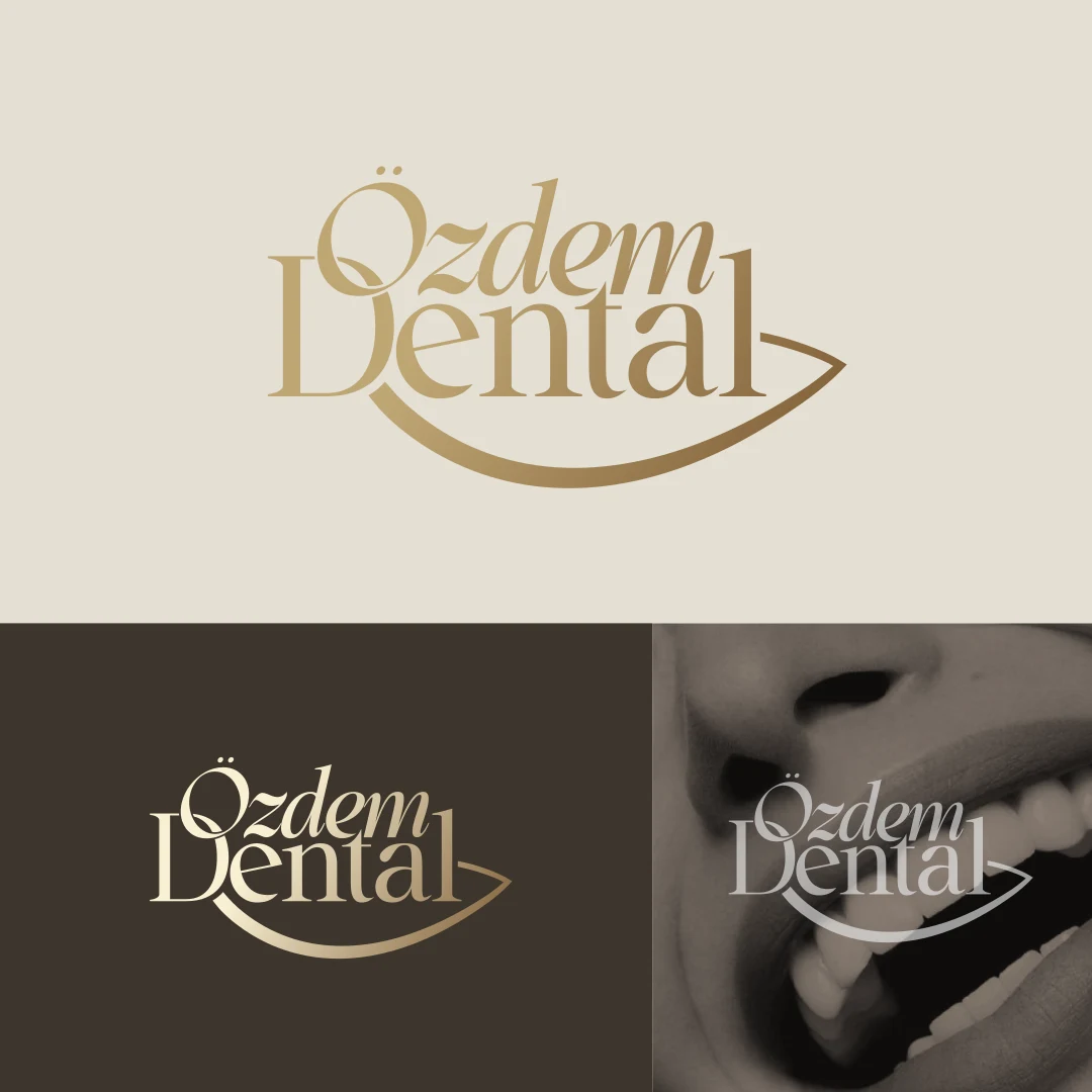
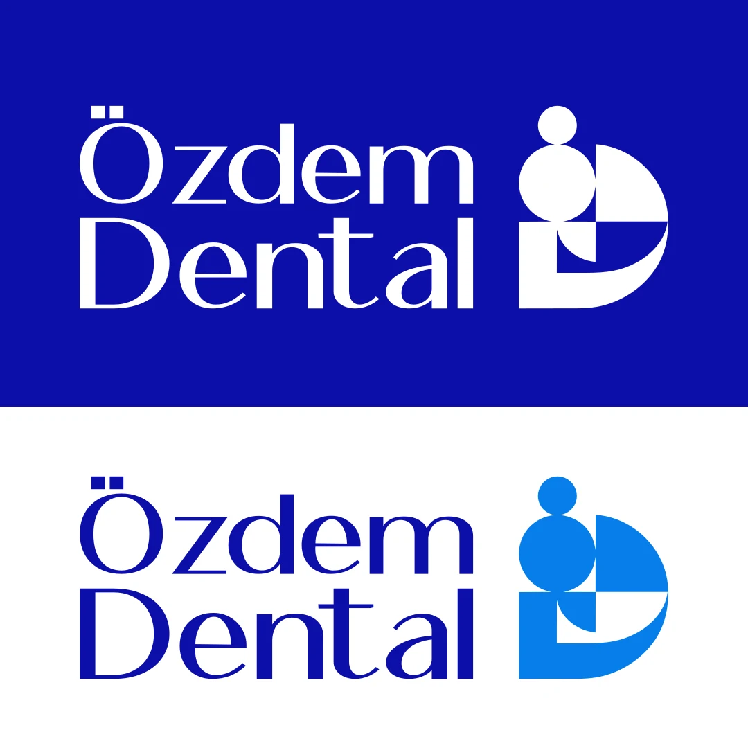
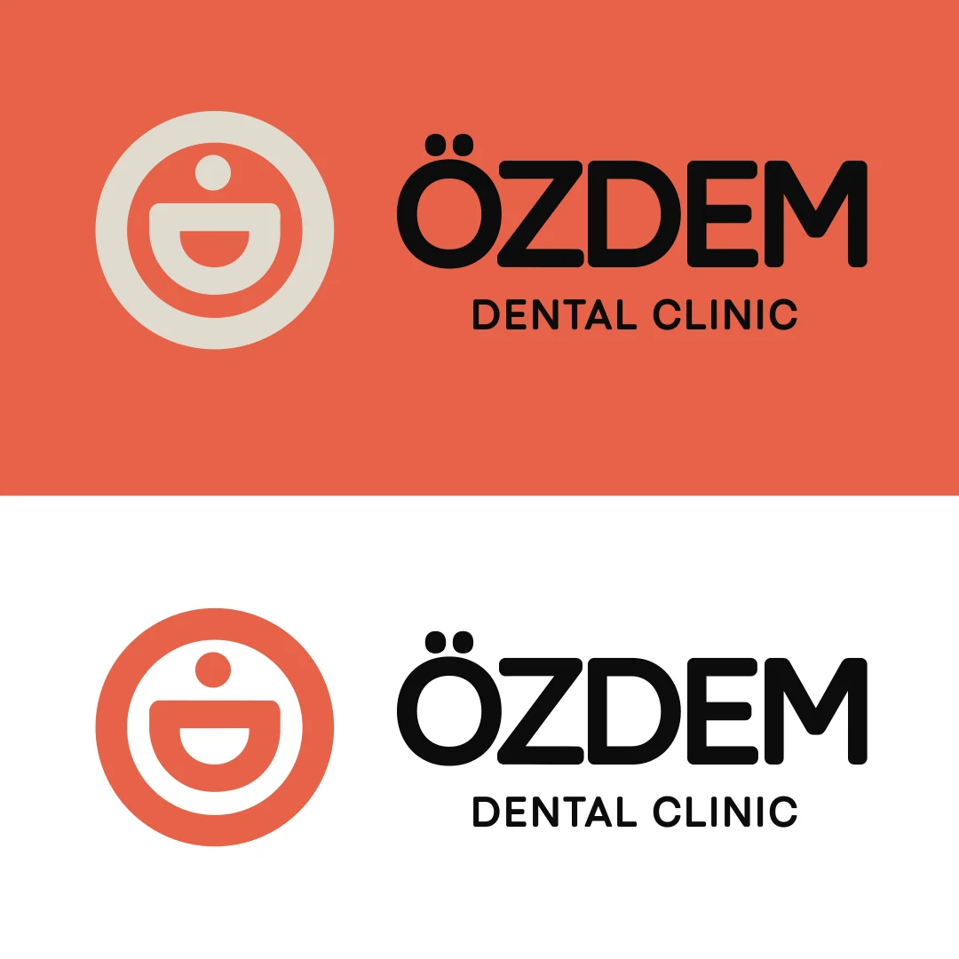
We presented the directions to the clinic not one by one, but all together on one table; the decision was made by comparison.
The idea reads through light, not the space inside the letter. It holds equally sharp on black, gold and ivory.
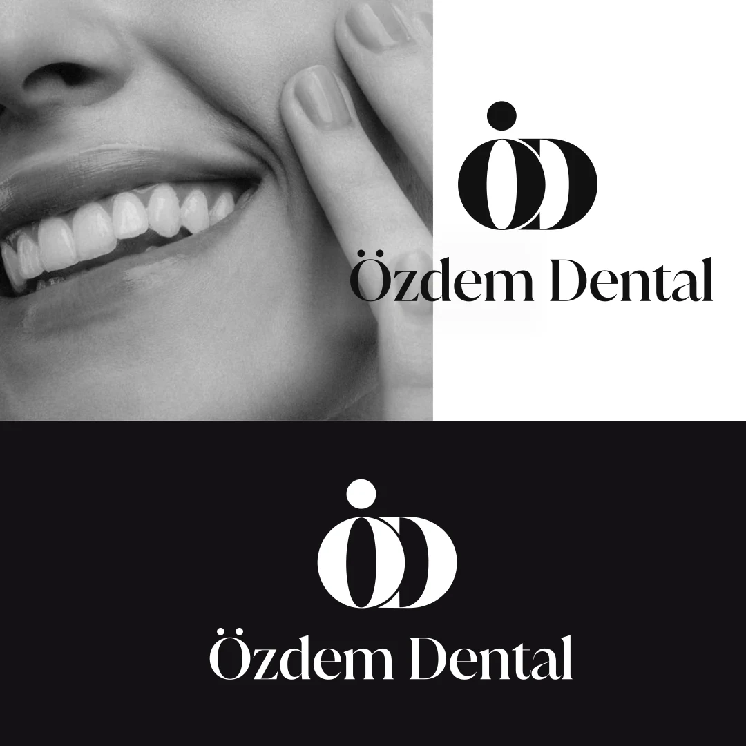
The stem of the Ö, the curve of the D and the point of light were each drawn by hand; proportions were tuned to stay legible at small sizes.
Gallery Modern — high-contrast display serif (logotype and headings)
Jost — body text, catalogue and web
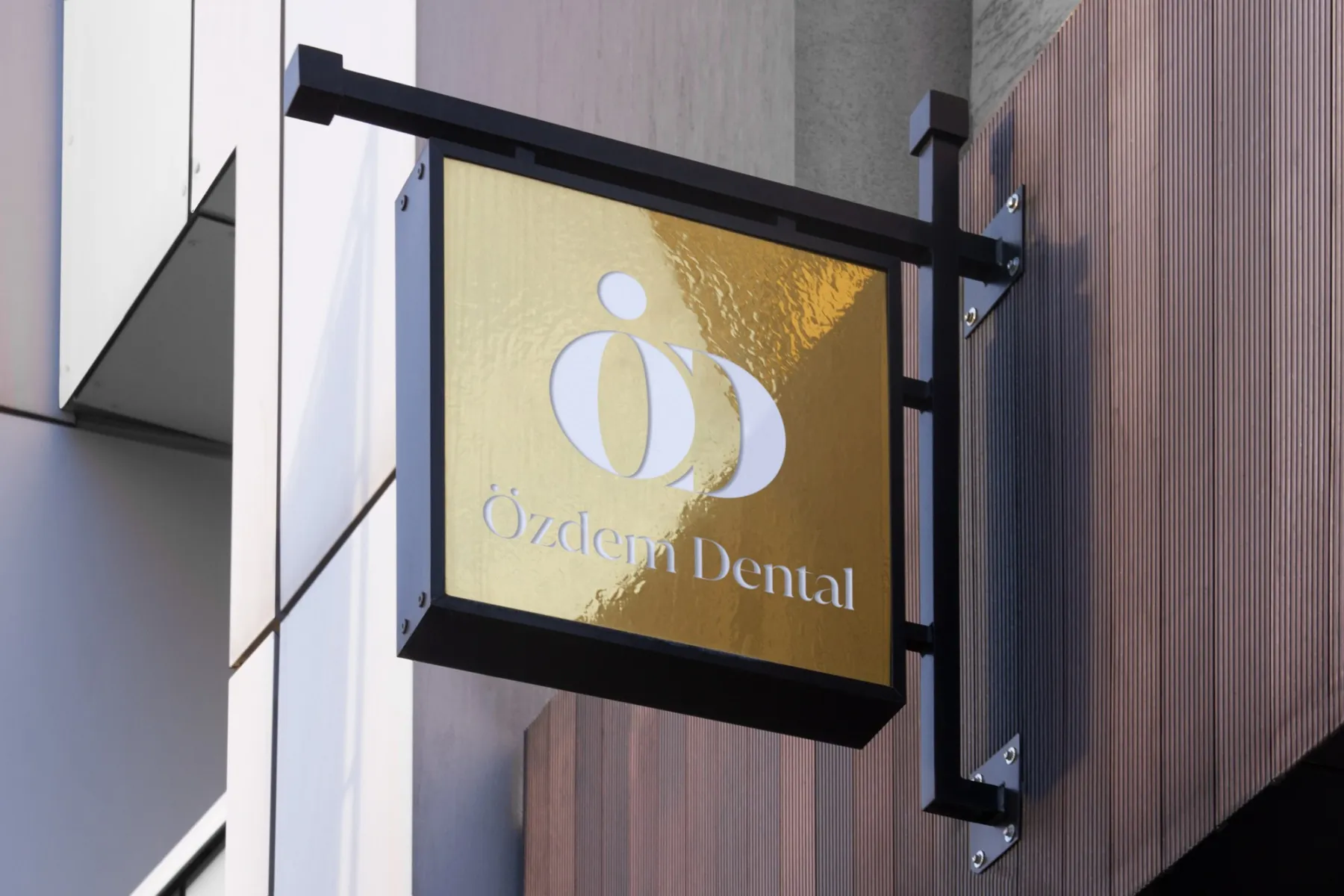
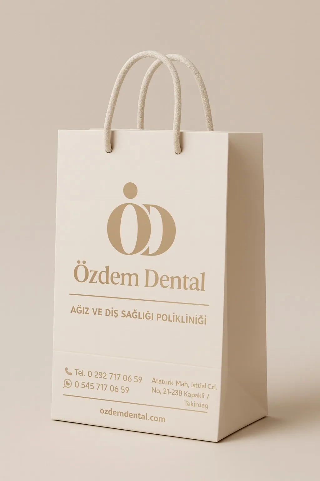
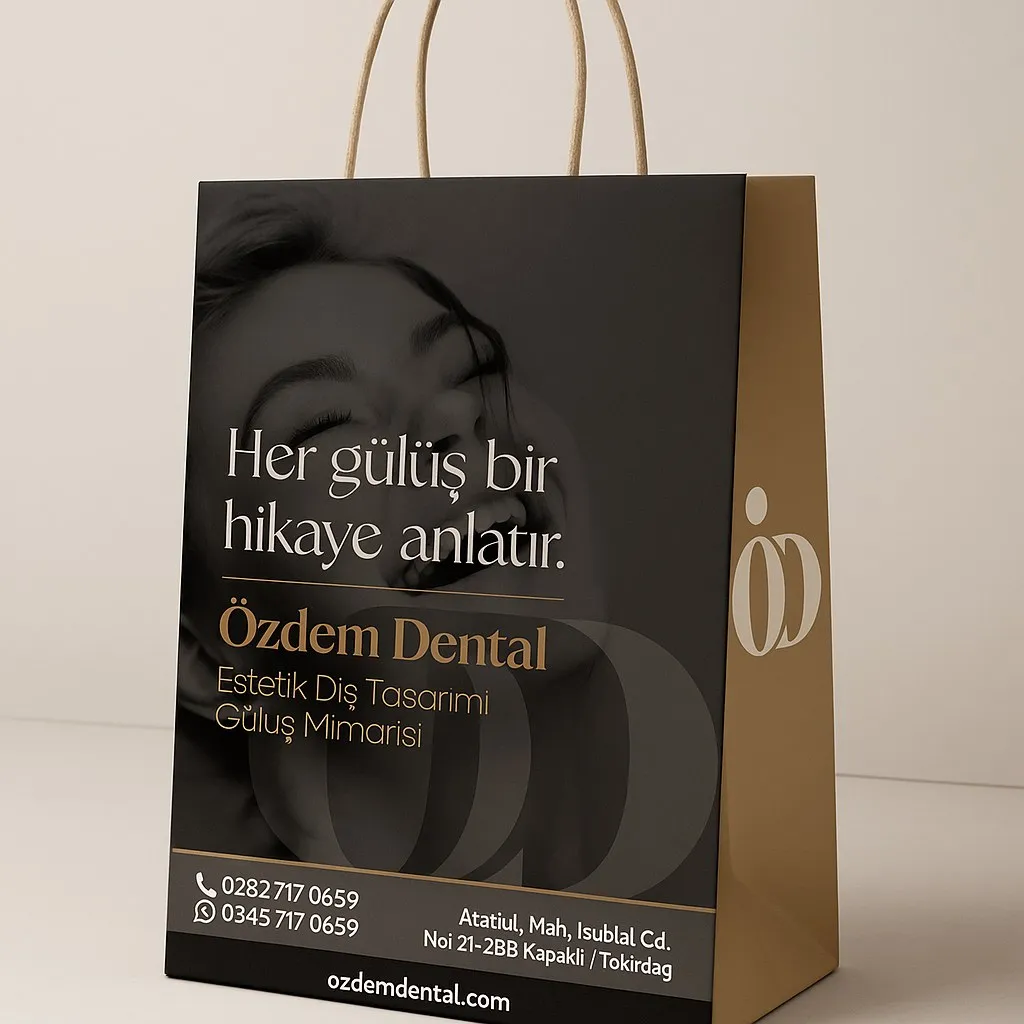
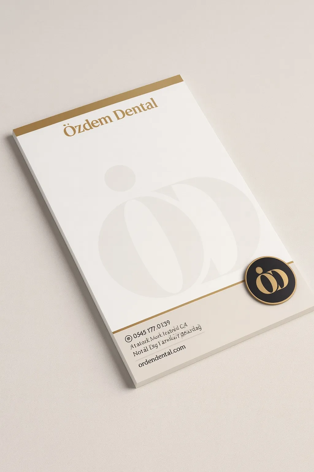
We didn’t leave the identity in a PDF. Everything a patient’s hand touches was designed: business card, letterhead, envelope, notepad, bag, catalogue, brochure, uniform.
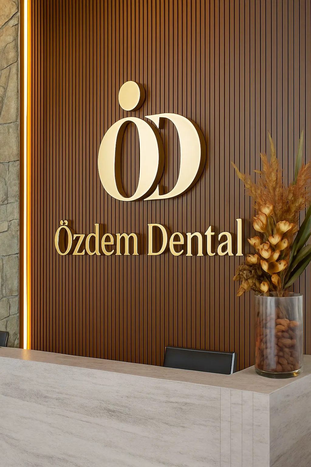
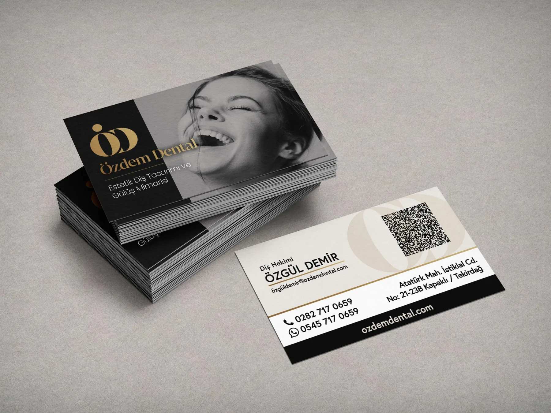
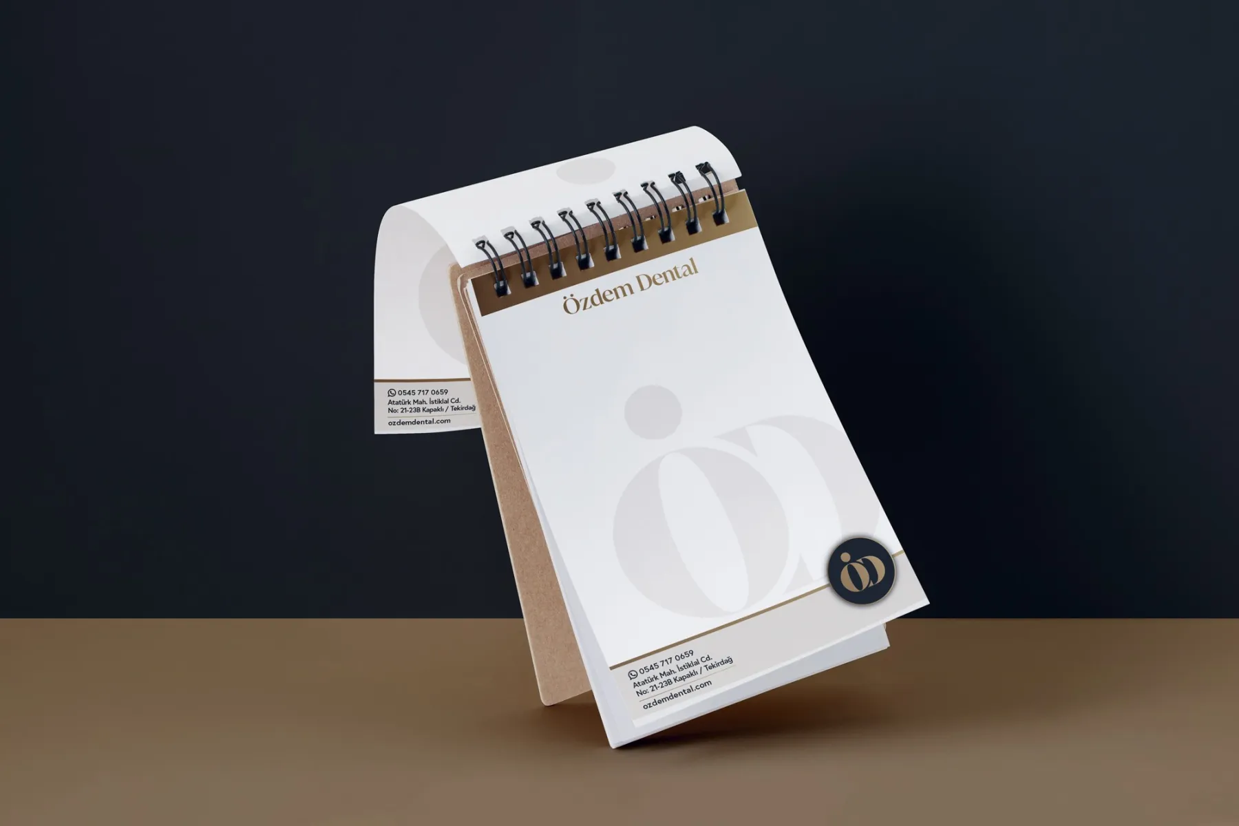
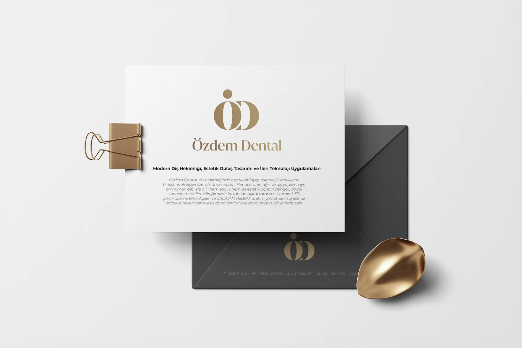
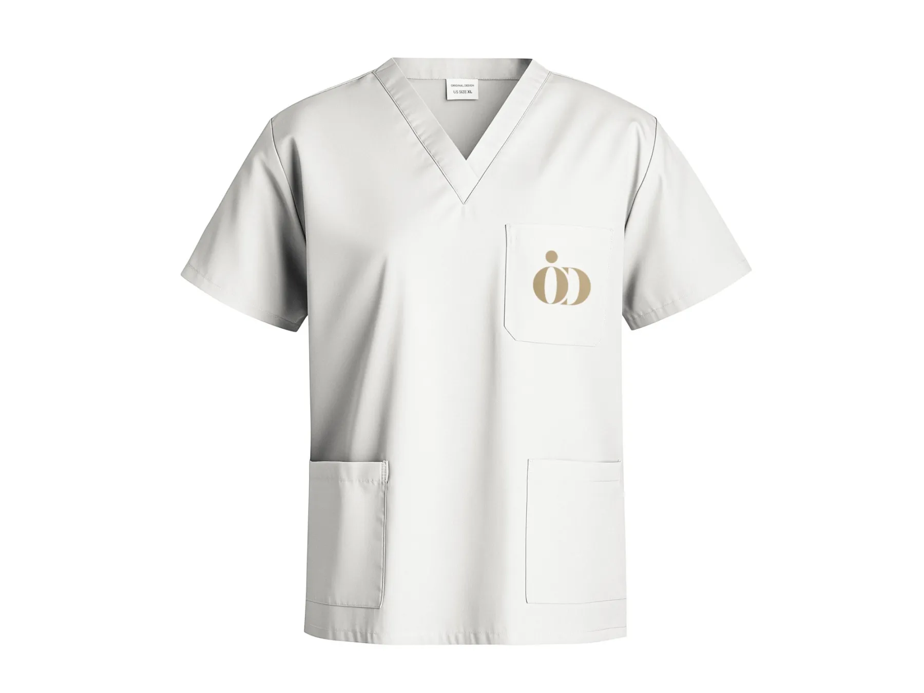
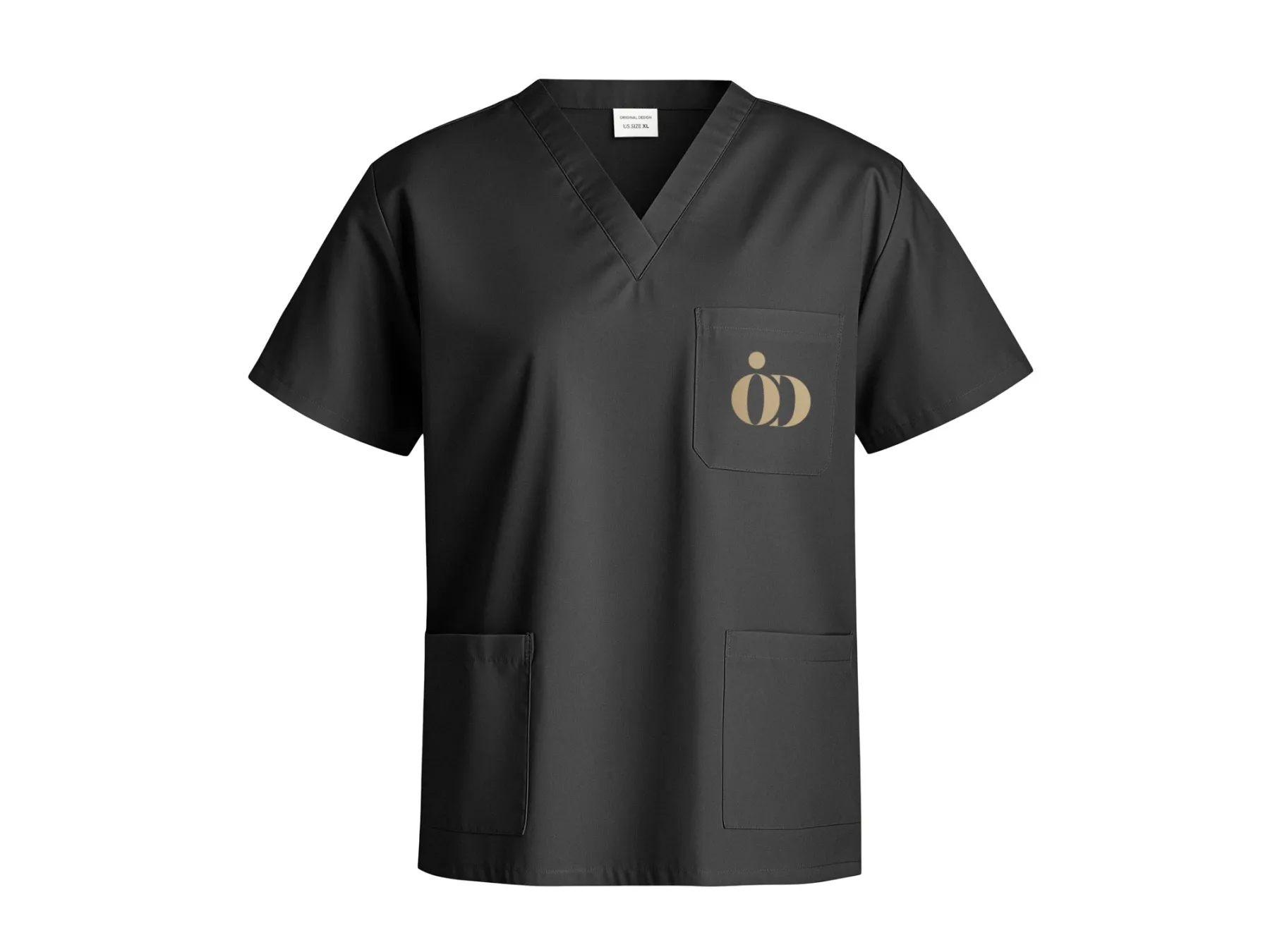
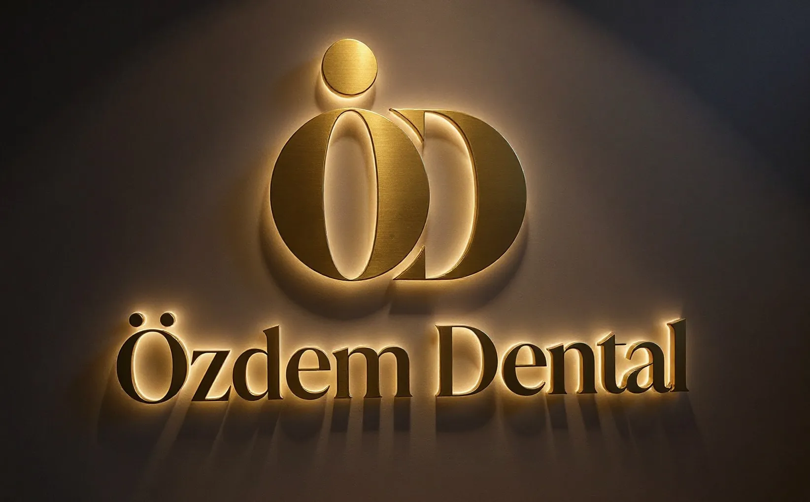
A logo has to live on screen too. We made different opening animations for the clinic’s videos, social media content and the waiting-room screen: from a 3D monogram that turns like a gold sculpture to minimal versions that appear in fine lines of light.
“Every smile tells a story.” A multi-page catalogue presenting the clinic, its dental team and treatments. We shot the photography ourselves and set the layout in the language of an architecture magazine.
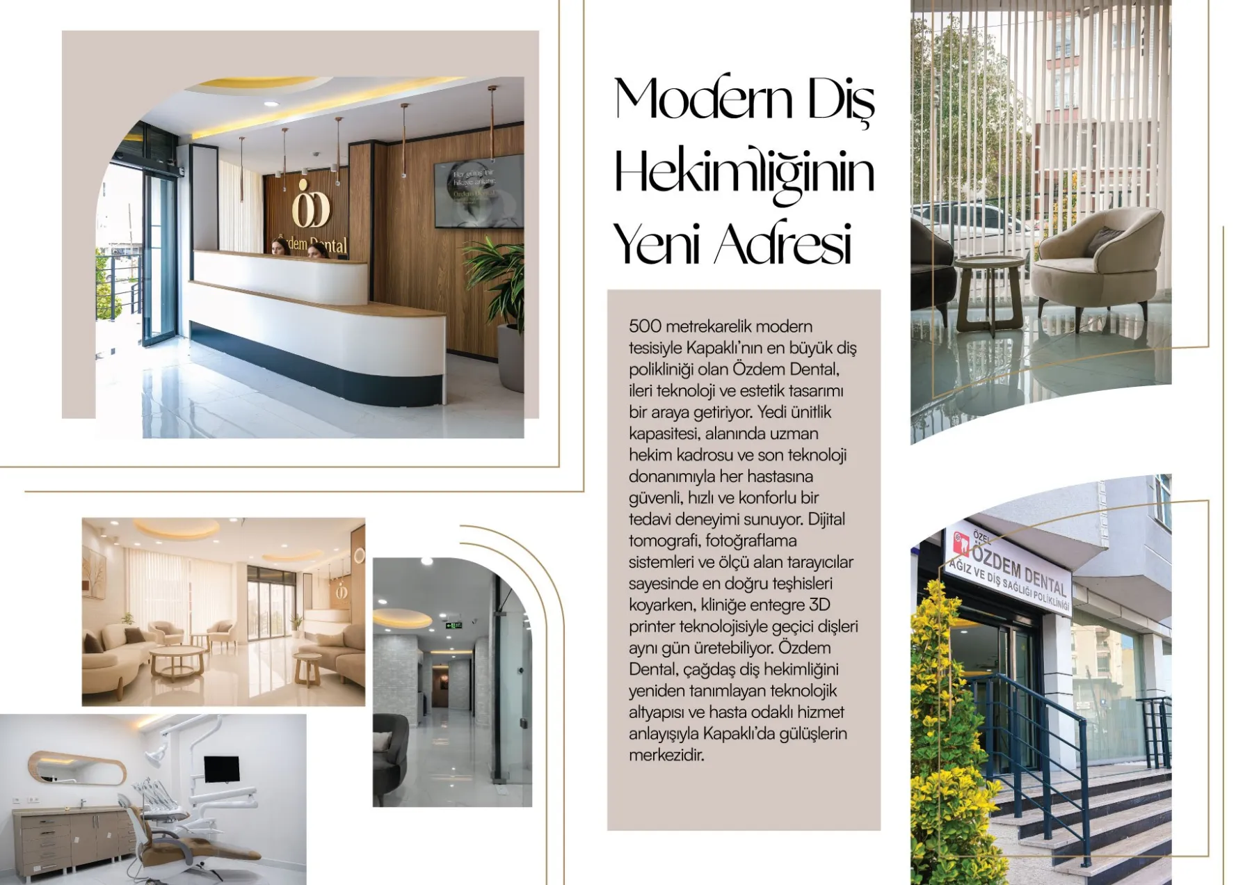
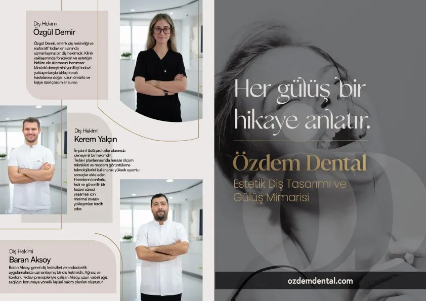
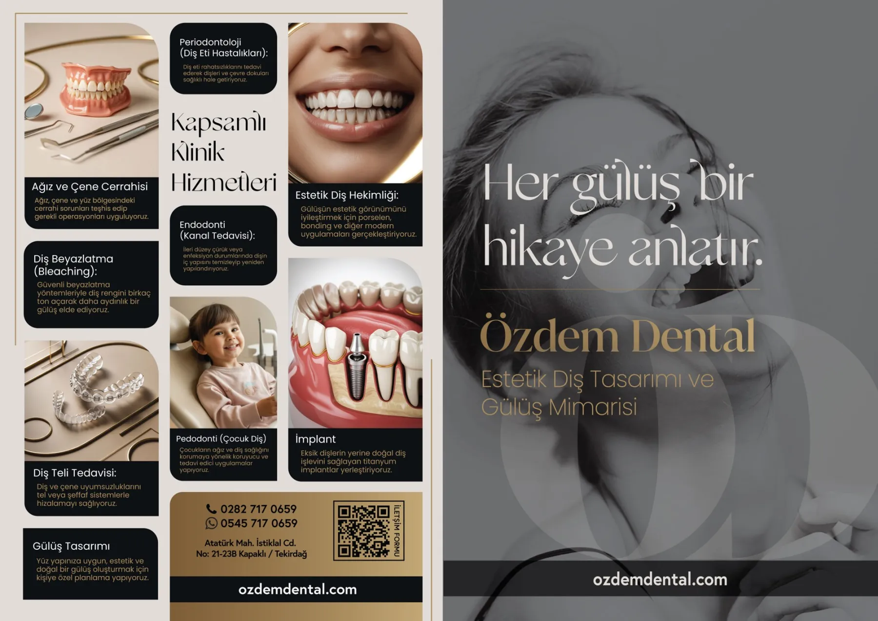
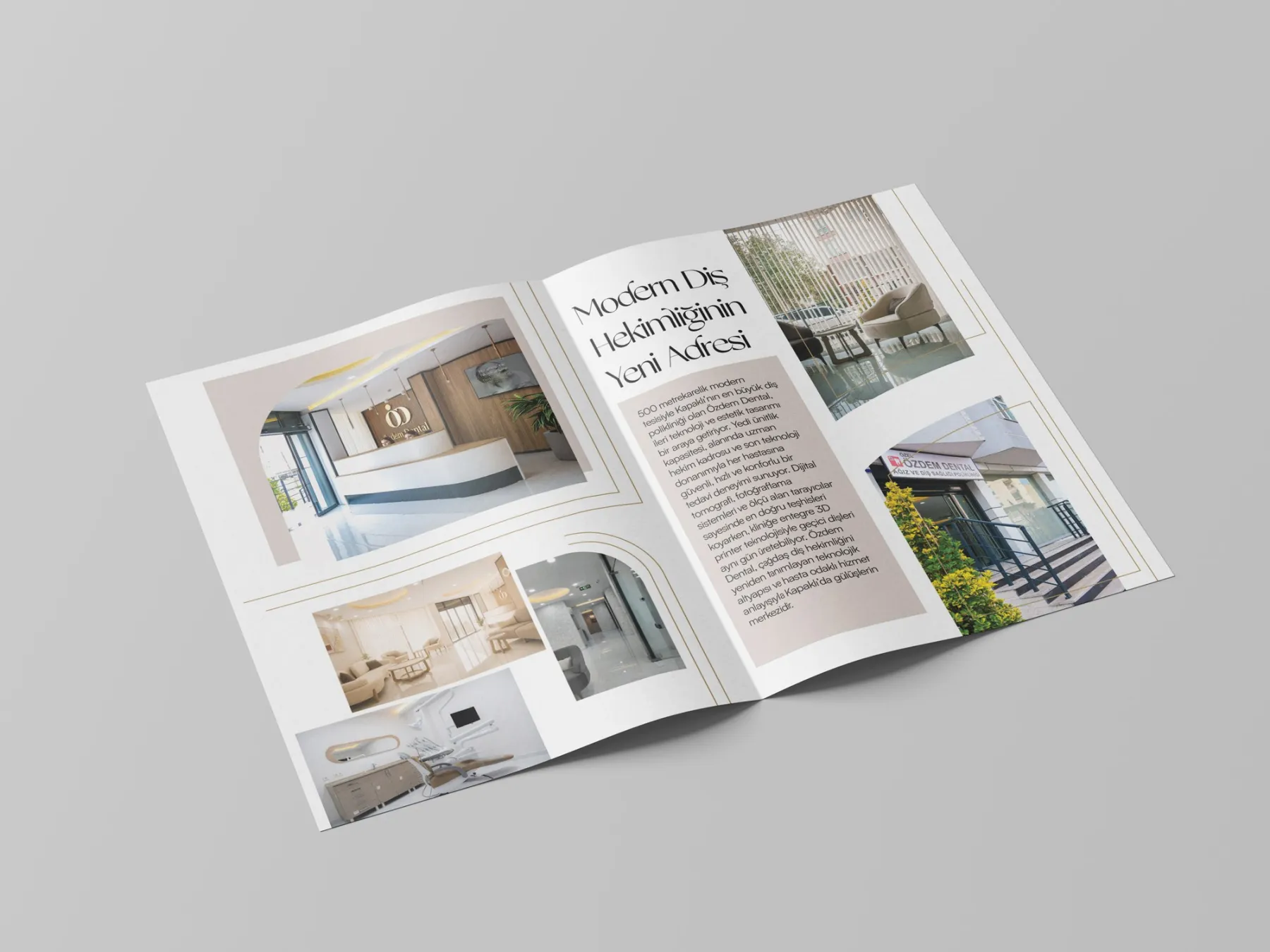
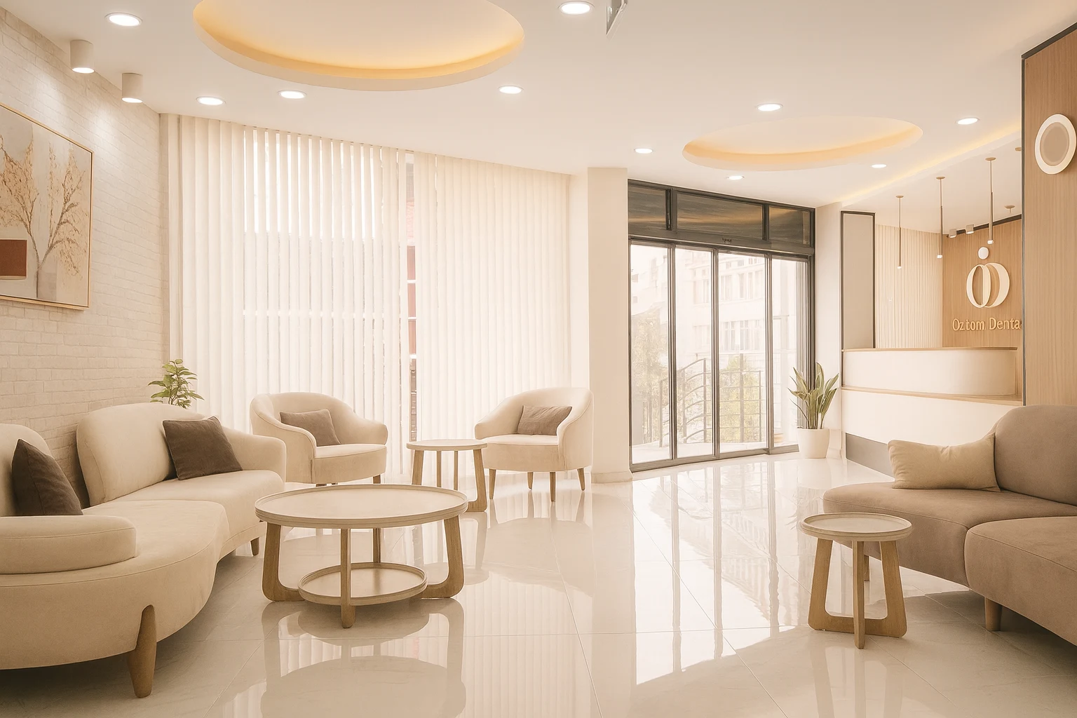
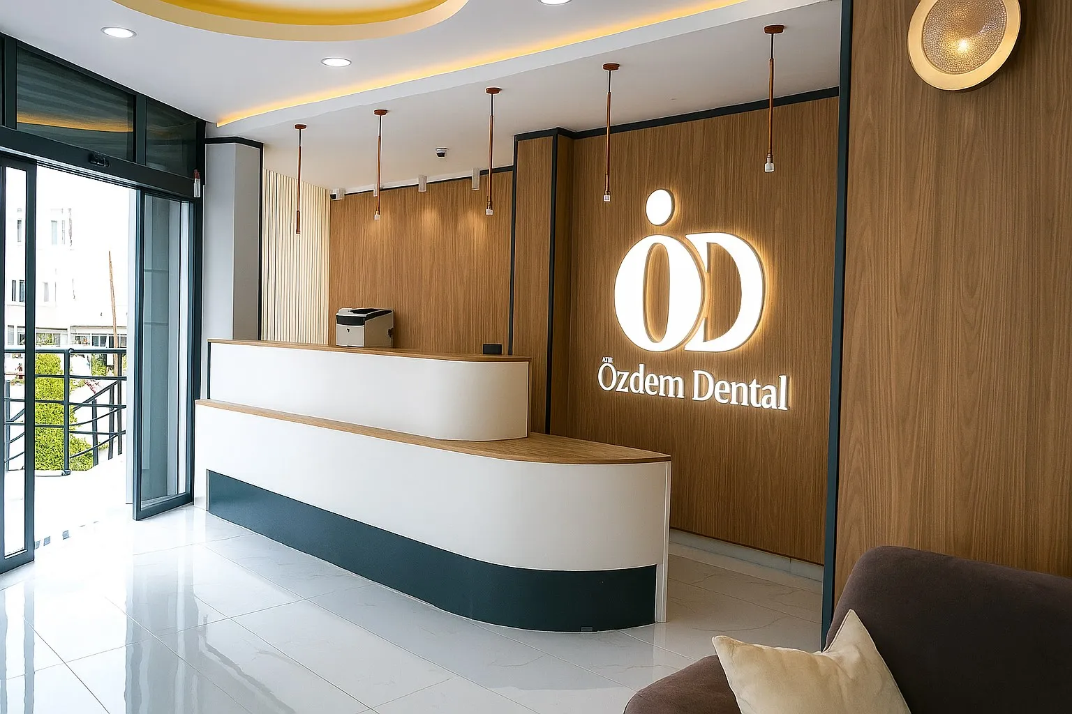
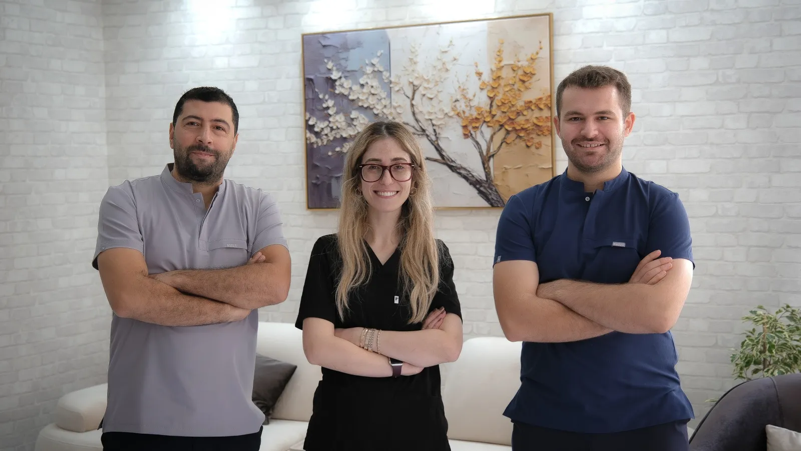
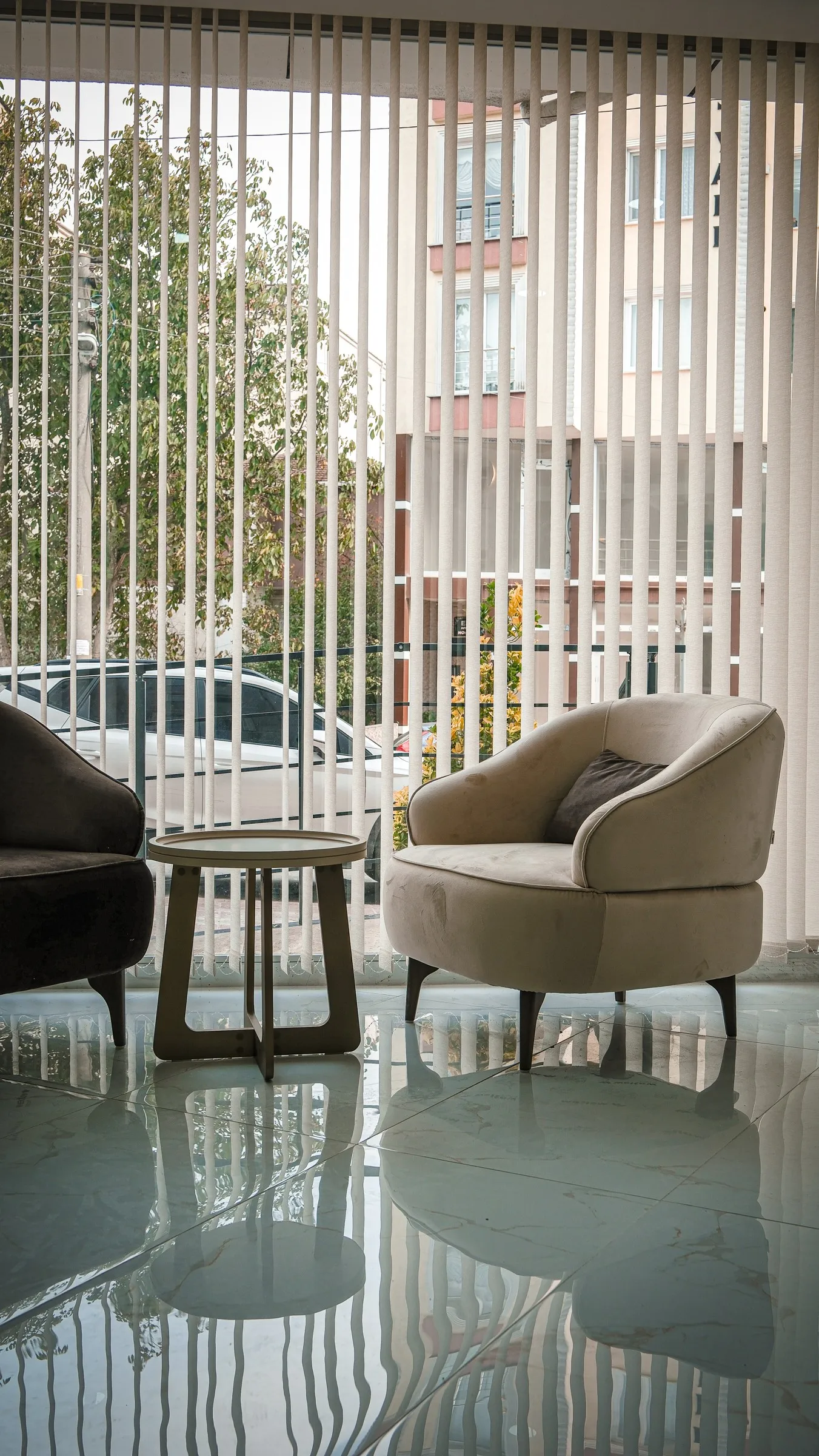
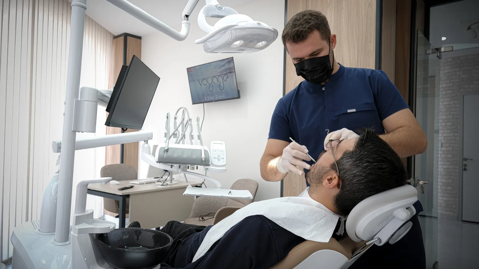
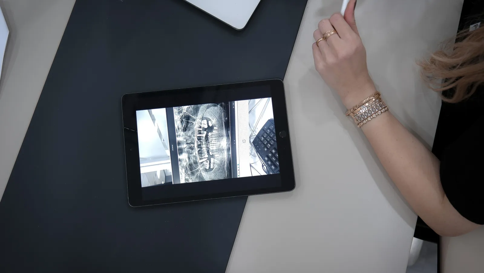
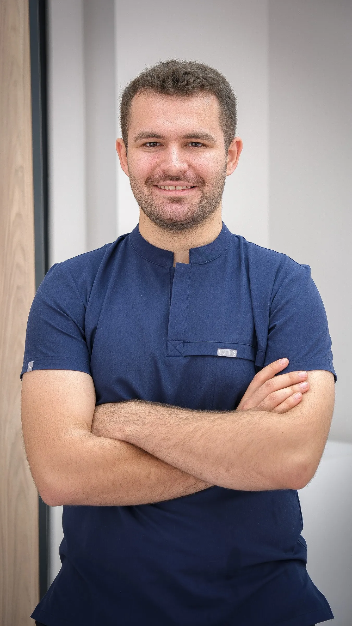
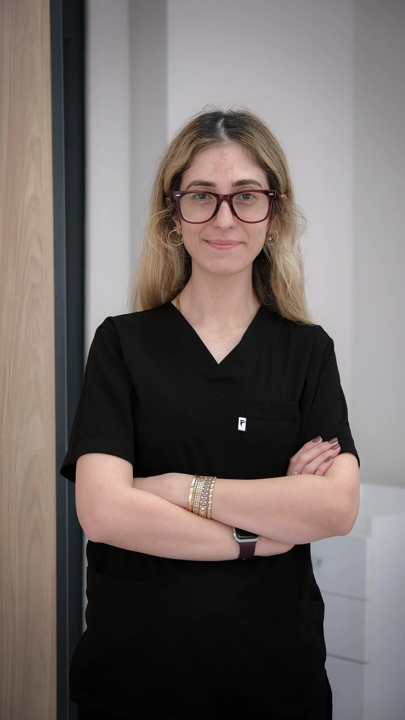
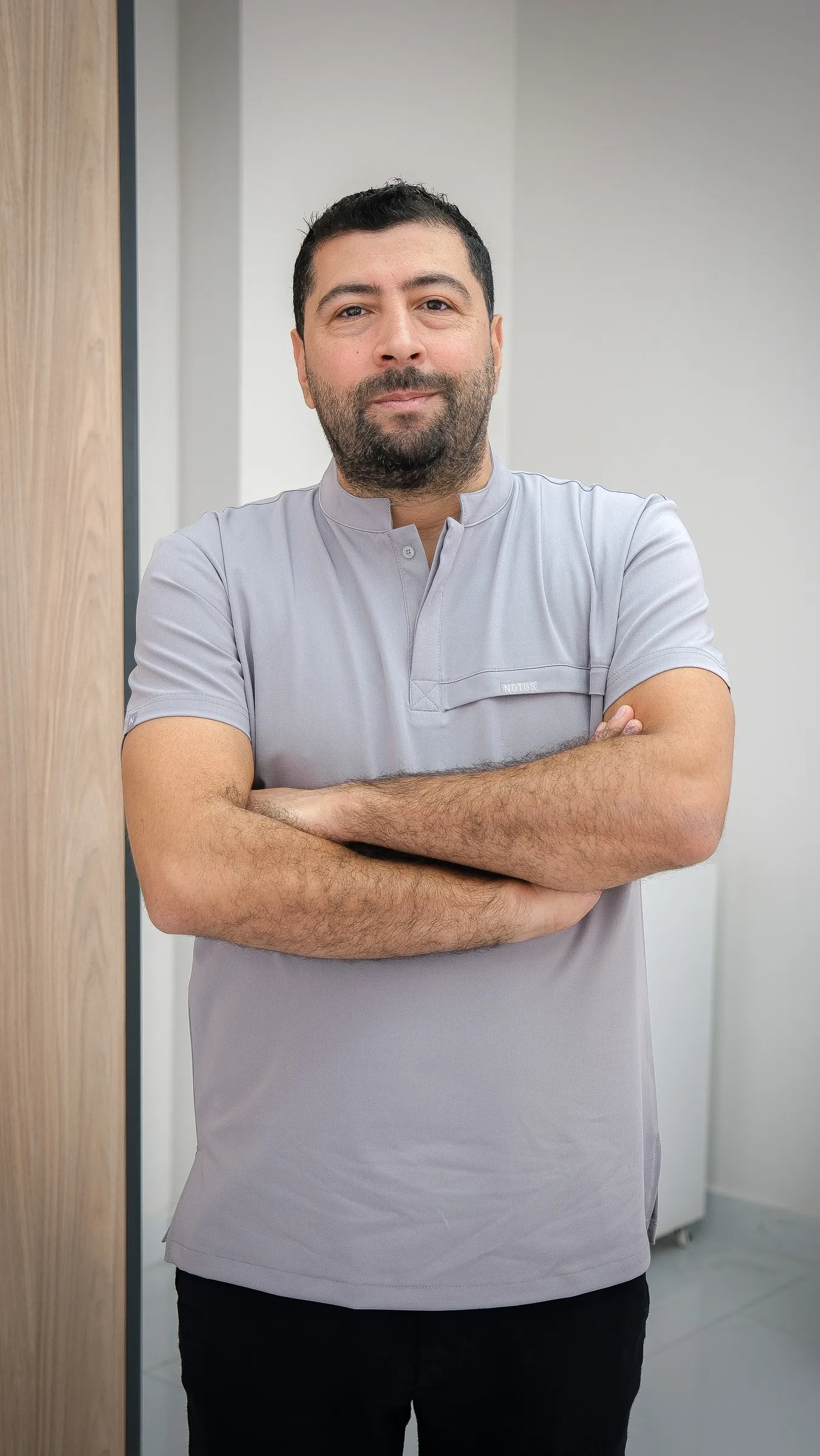
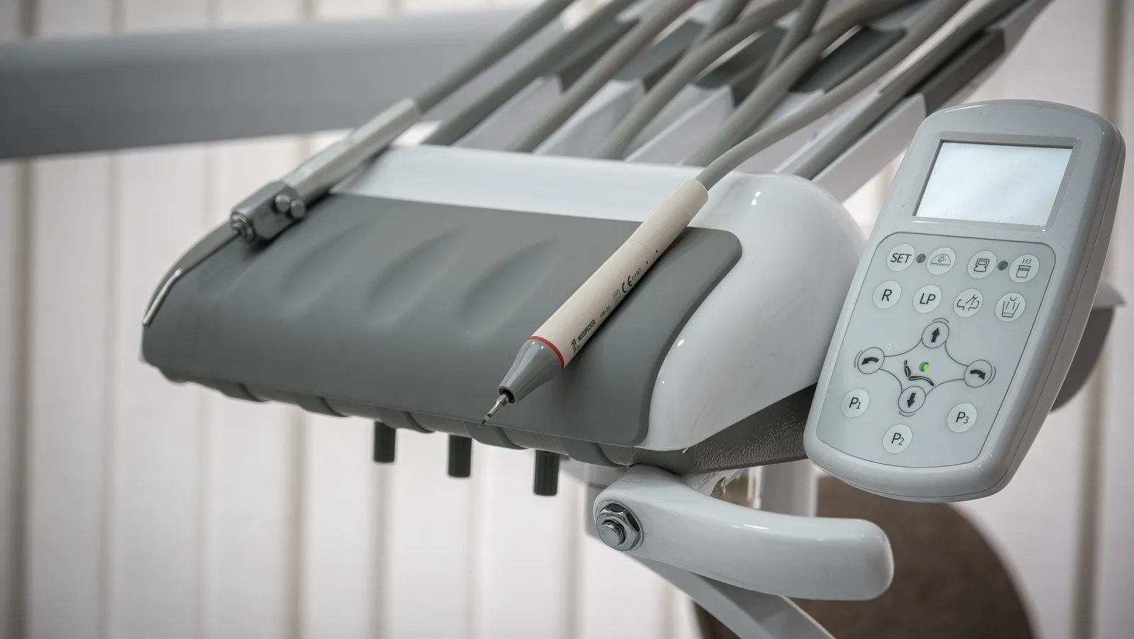
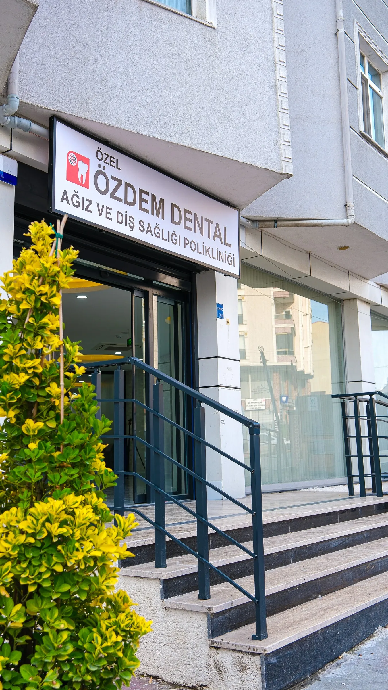
We produced the clinic’s entire visual archive in a single day: from the facade to the treatment rooms, from dentist portraits to the team photo. Every photo used on the website, in the catalogue and on social media comes from this shoot.
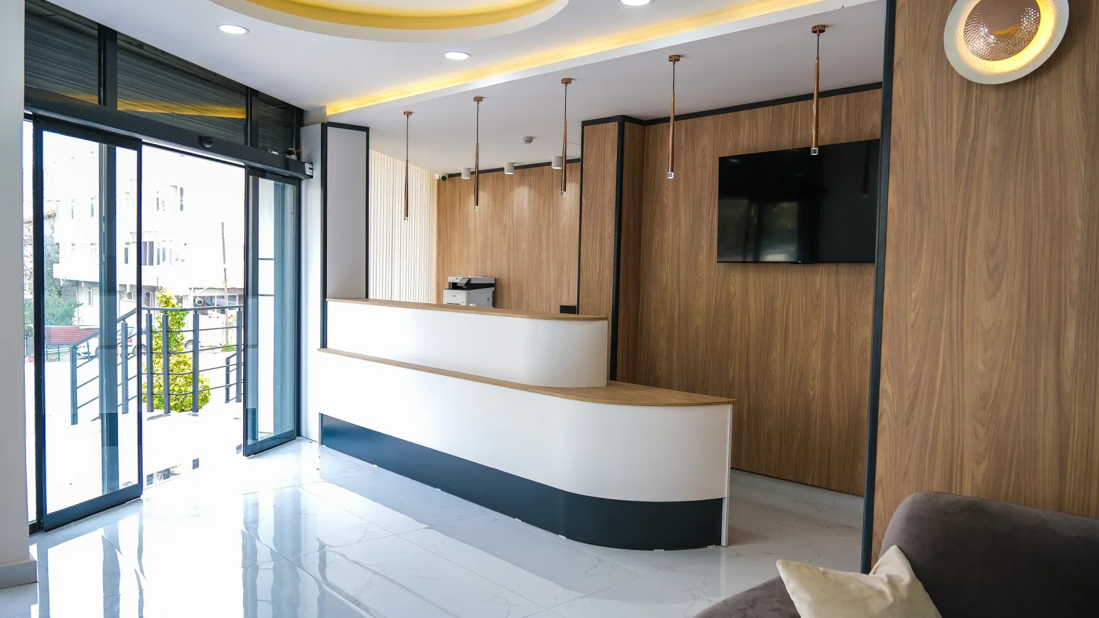
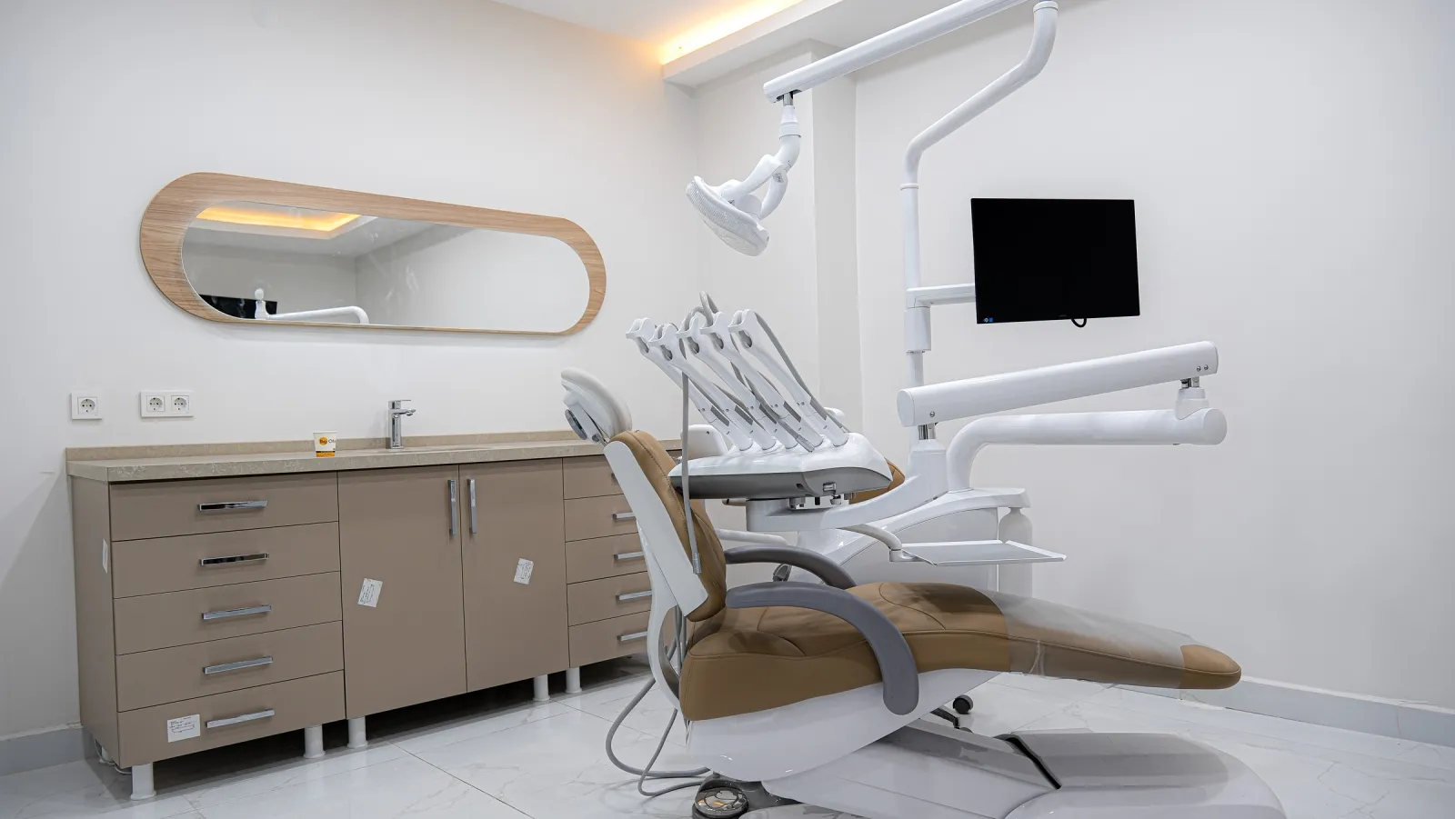
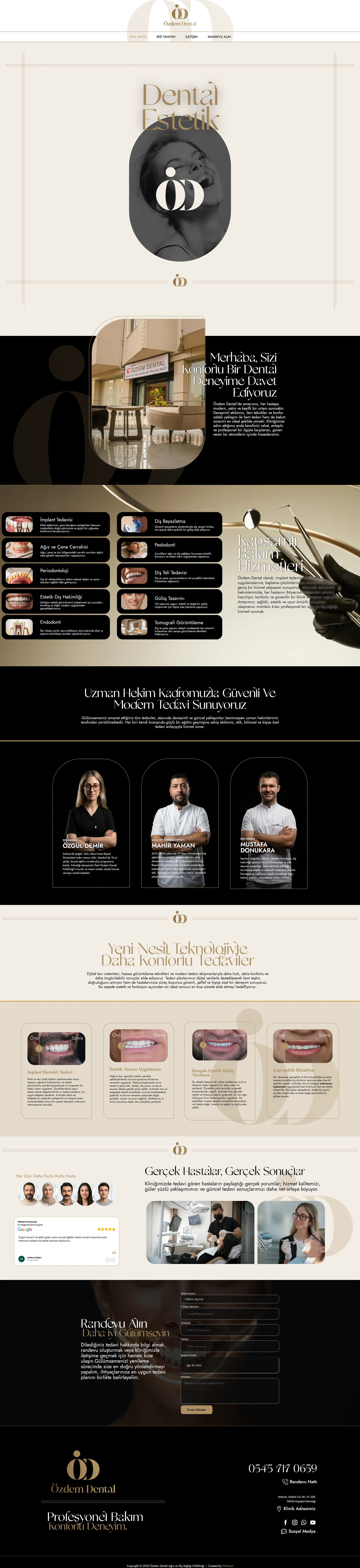
The arch form comes from the O in the logo and is used like a window throughout the site. A site with the calm of a hotel lobby, moving between dark and light sections.
Arched photo frames and the ÖD watermark create a seamless transition between identity and site.
Portraits we shot ourselves against a black backdrop make the specialist team recognisable at a glance.
Before/after comparisons with a draggable slider, so patients can see the difference with their own eyes.
Videos we shot and edited for the clinic’s Instagram: short films about the space, the dentists and treatment results.
An animated before/after film combining real treatment results with the logo’s language of light.
We made a short promo film to showcase our work for Özdem Dental on our own channels: brand strategy, logo, corporate identity, website and Google integration in a single flow.
It shows how a clinic brand is built in under a minute.
The clinic opened in December 2025, and we set up the ad account from day one. With Maps and search campaigns, monthly patient reach rose from 352 to 1,527 in four months. Figures taken directly from the ad account.
Phone calls and direction requests. Every month above the last.
Source: Özdem Dental Google Ads account · December 2025 – April 2026