 Start a project →Start a project →
We built a new polyclinic’s entire digital identity from scratch: logo, corporate identity, website, clinic shoots and ad account. Then we moved on to the real job: making the phone ring.
When Dr. Ömer Faruk Karabey opened his new clinic, he had a name and nothing else. In six months we designed, built and measured every touchpoint, from business card to Google Maps.
The neighbourhood already had established clinics. A new name needed trust, visibility and a steady flow of patients in its first months. The brand had to feel premium without feeling intimidating.
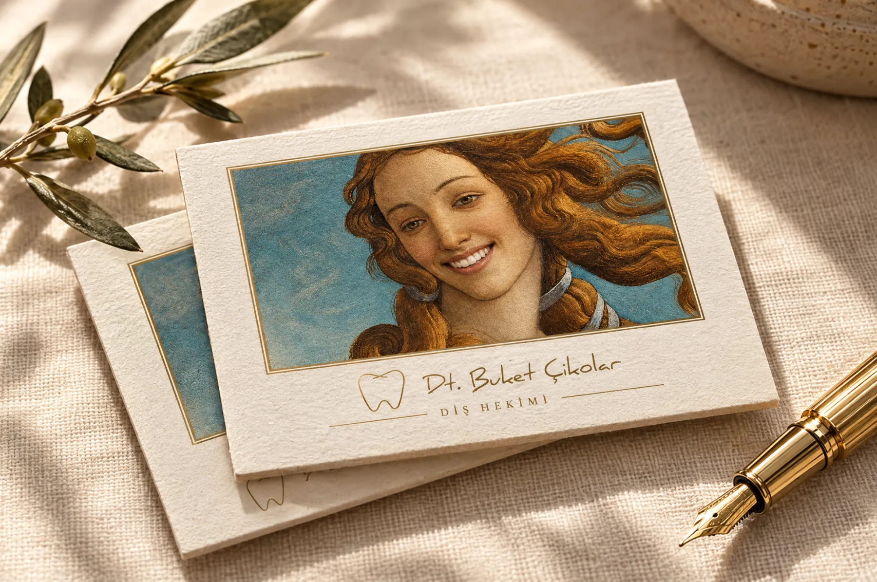
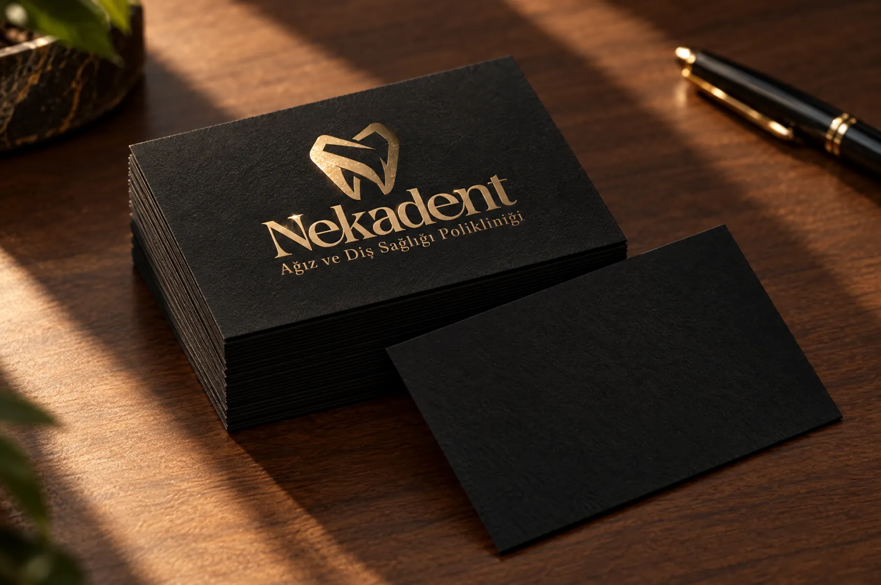
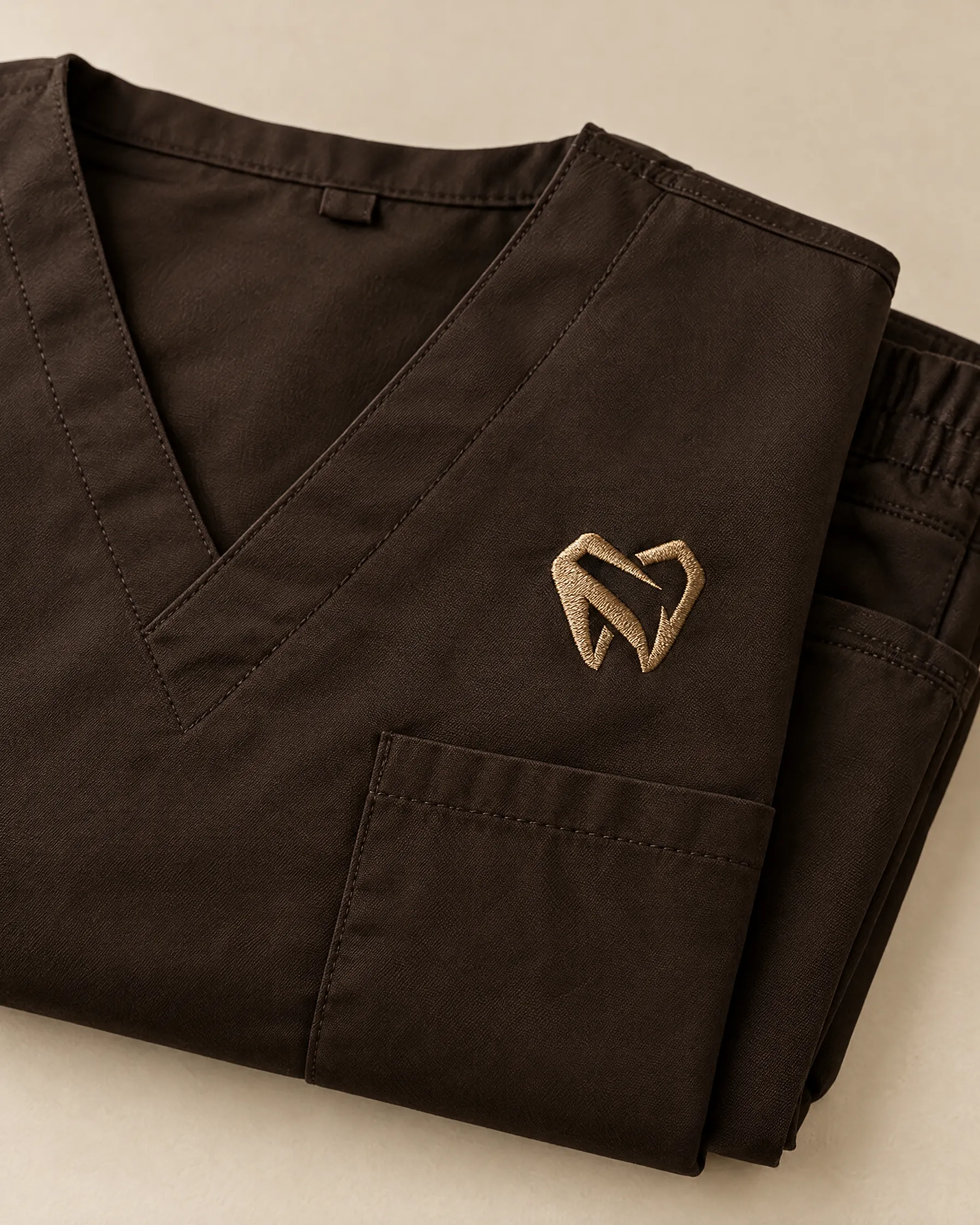
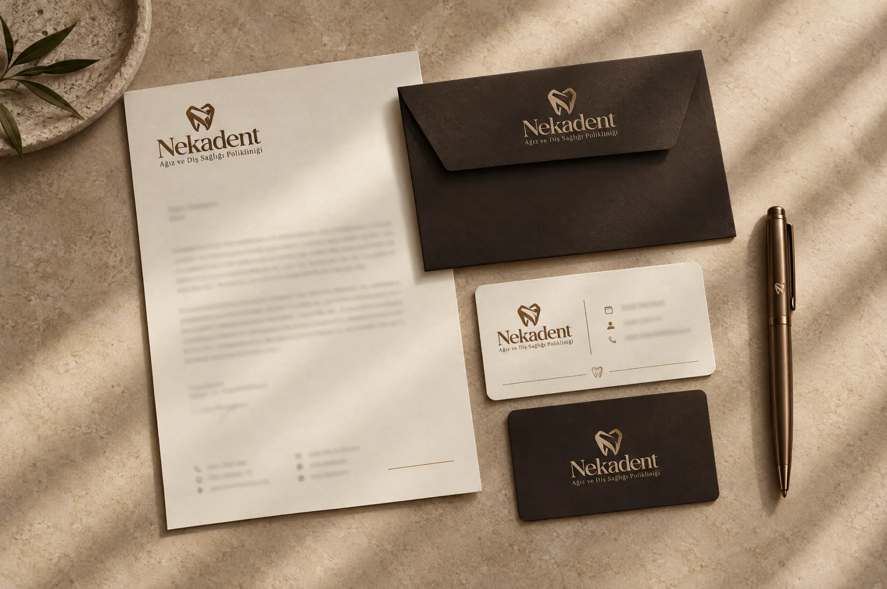
A warm bronze–espresso palette, a crisp yet softly contoured tooth symbol and a classic serif logotype. The same language repeats across stationery, web, video and ad creatives; patients see the same clinic everywhere.
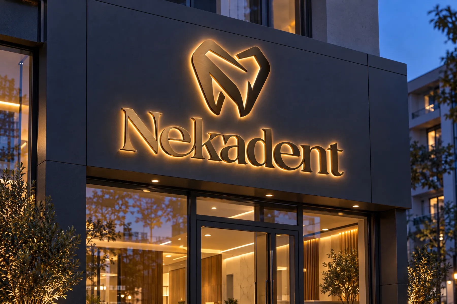
The symbol is a molar drawn in two strokes: the outer contour stands for protection, the inward-curling cut for the dentist’s touch. The bronze gradient carries the logo with equal elegance in light and in foil printing on paper.
Outfit — web headings and social media
Afacad — body copy, forms, brochure
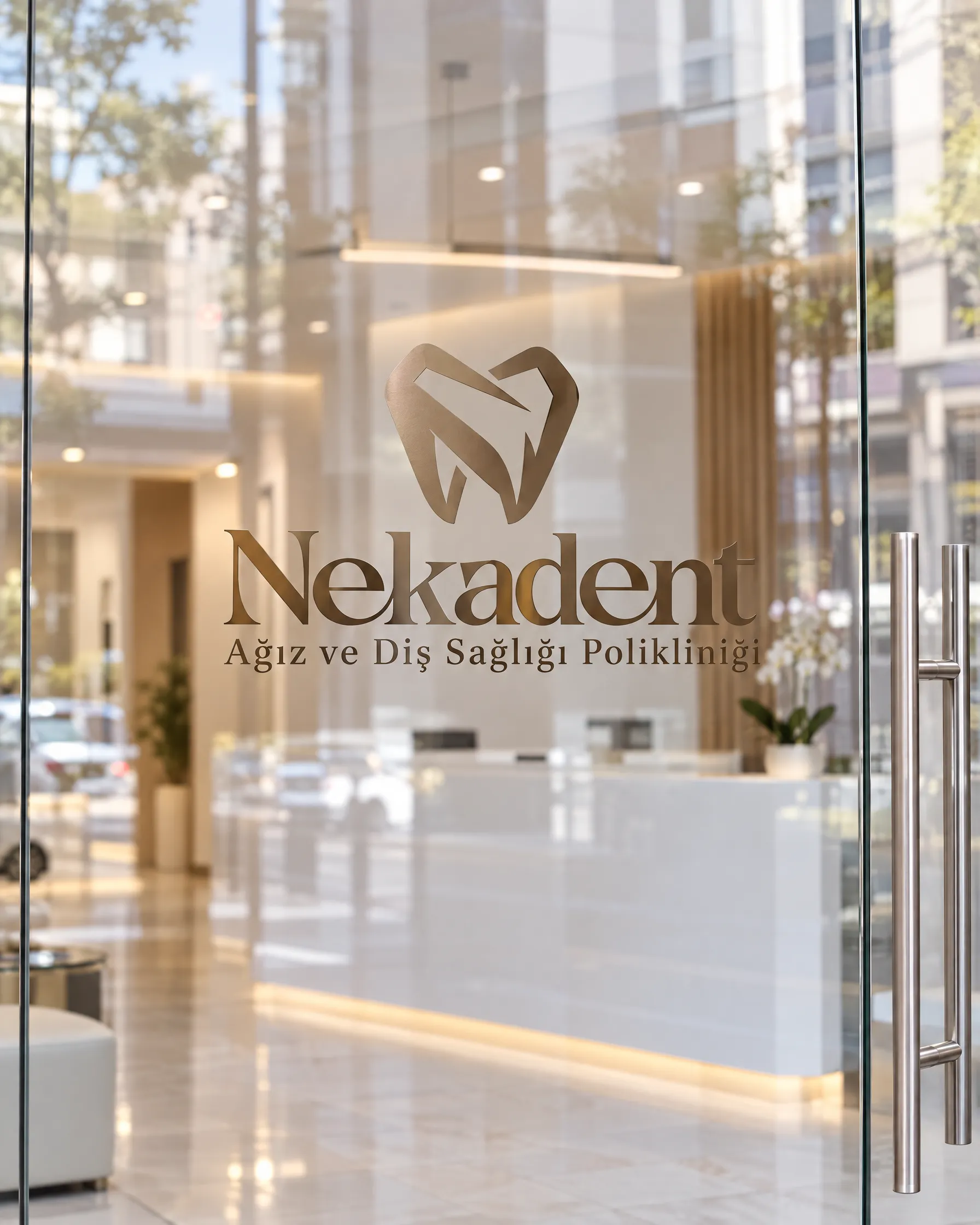
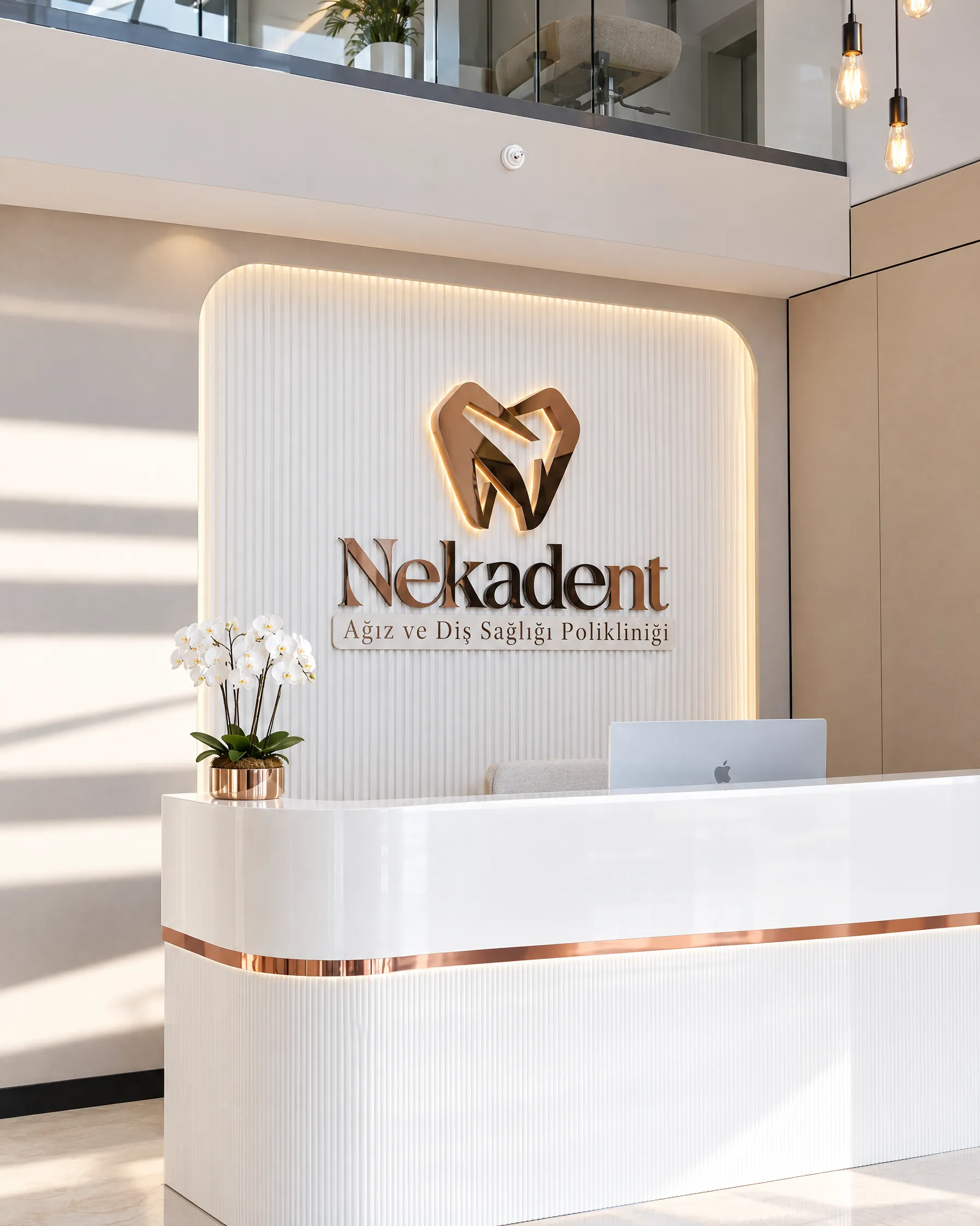
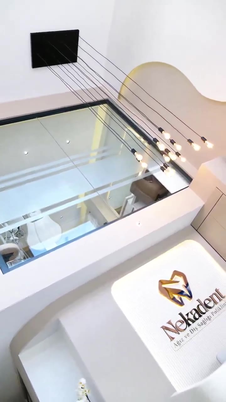
The illuminated panel behind reception is the logo’s first encounter with patients in the space. White lacquer, a copper line and a backlit symbol; patients see the brand the moment they walk in.
We delivered the logo in every size needed for the interior, in illuminated and non-illuminated versions.
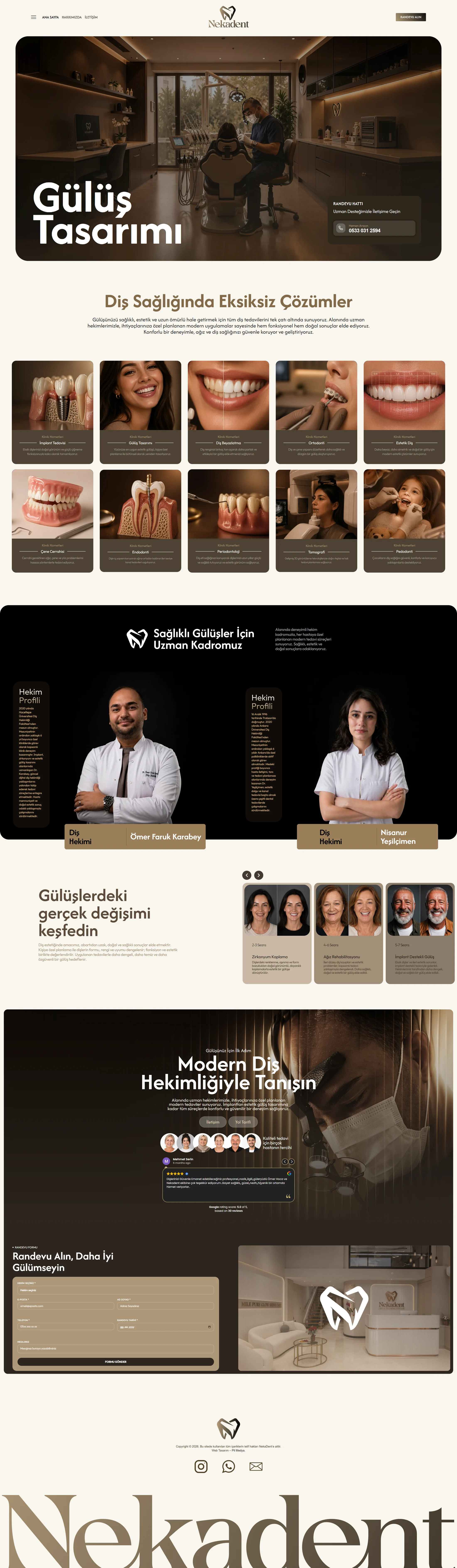
We didn’t ship nekadent.com by sticking a logo on an off-the-shelf theme. Page structure, copy, every image on the site, design and build all came from us in a single 20-day workflow. The goal was simple: before leaving the site, every visitor either calls or books.
Each section has one job. As visitors scroll, their questions are answered in order: “What do they do?”, “Who does it?”, “What are the results?”, “What do others say?”, “How do I book?”
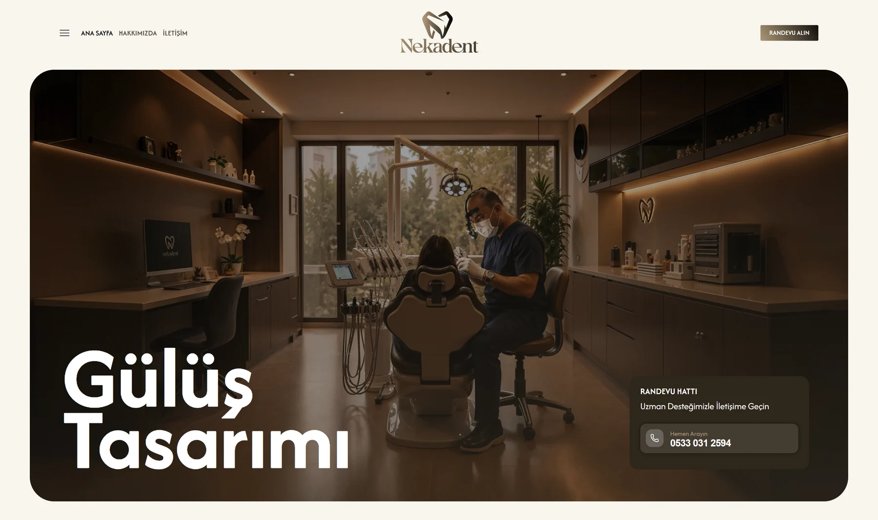
A real treatment moment in dim, warm light and a large headline. Bottom right, an appointment line card: visitors see the phone number before scrolling further and can call with a single tap.
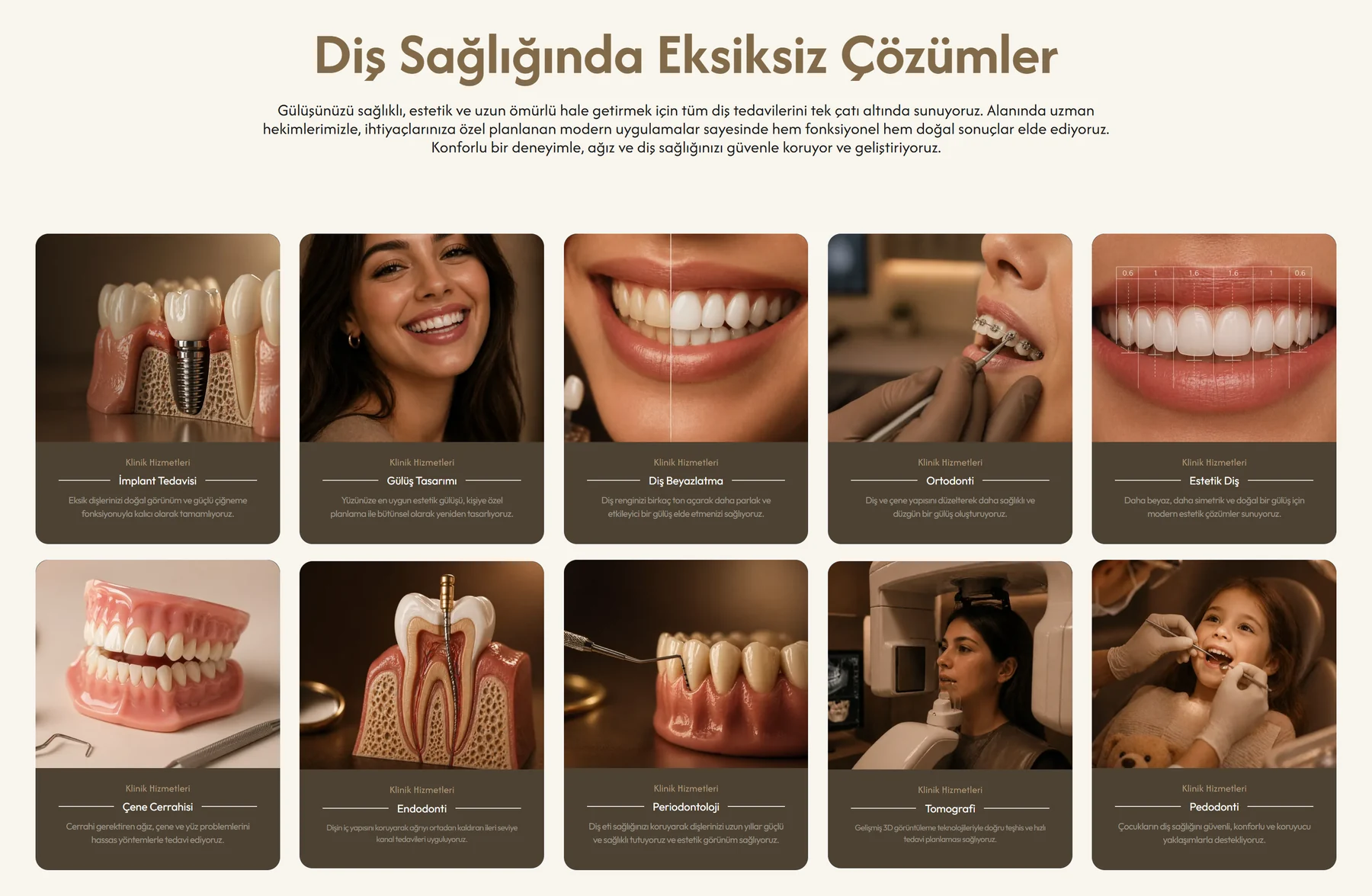
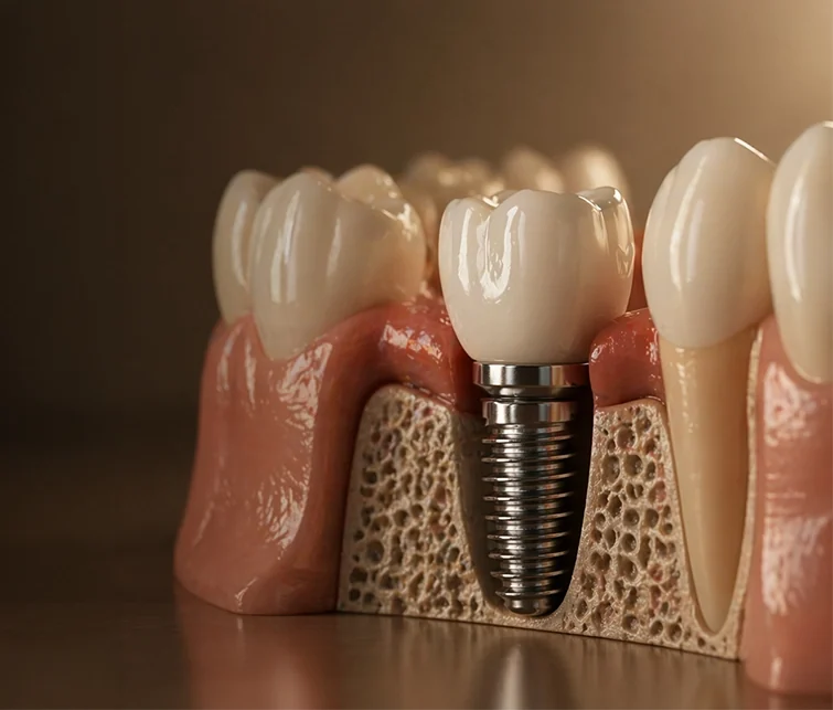
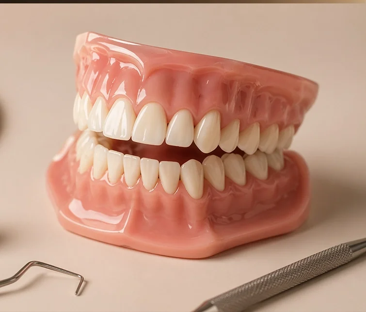
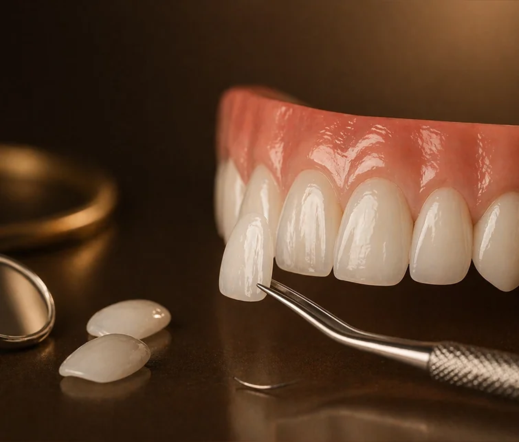
From implants to paediatric dentistry, every treatment has its own card and its own image. All were shot in the same light and the same bronze tone; side by side, they speak the language of one clinic. Each card leads to that treatment’s detailed page.
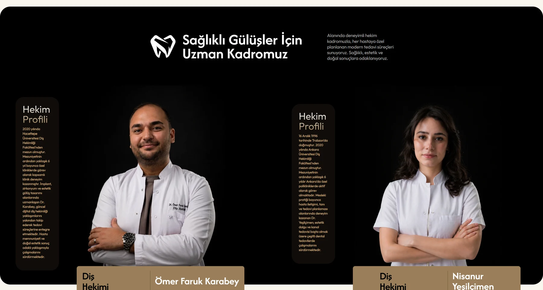
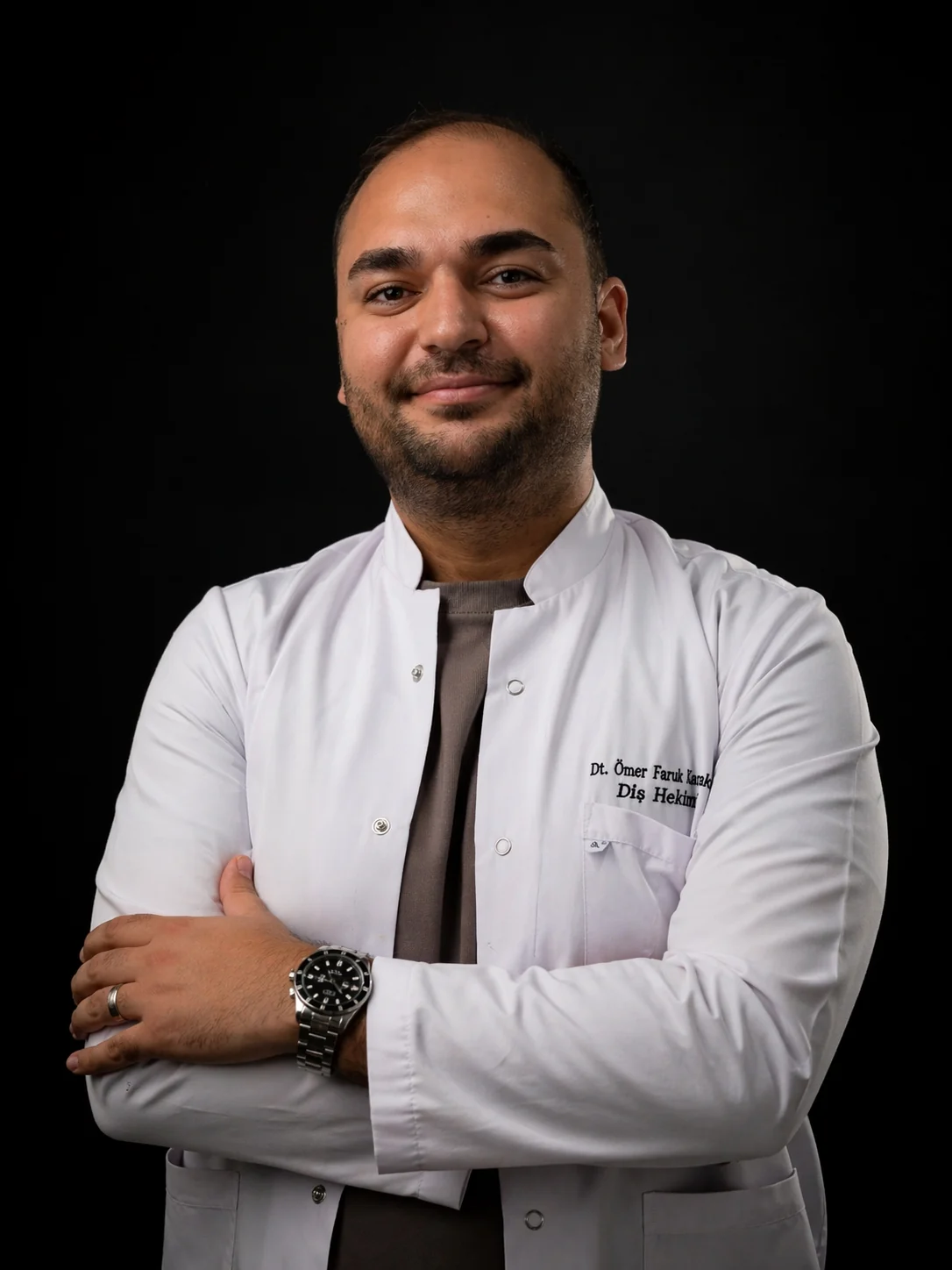
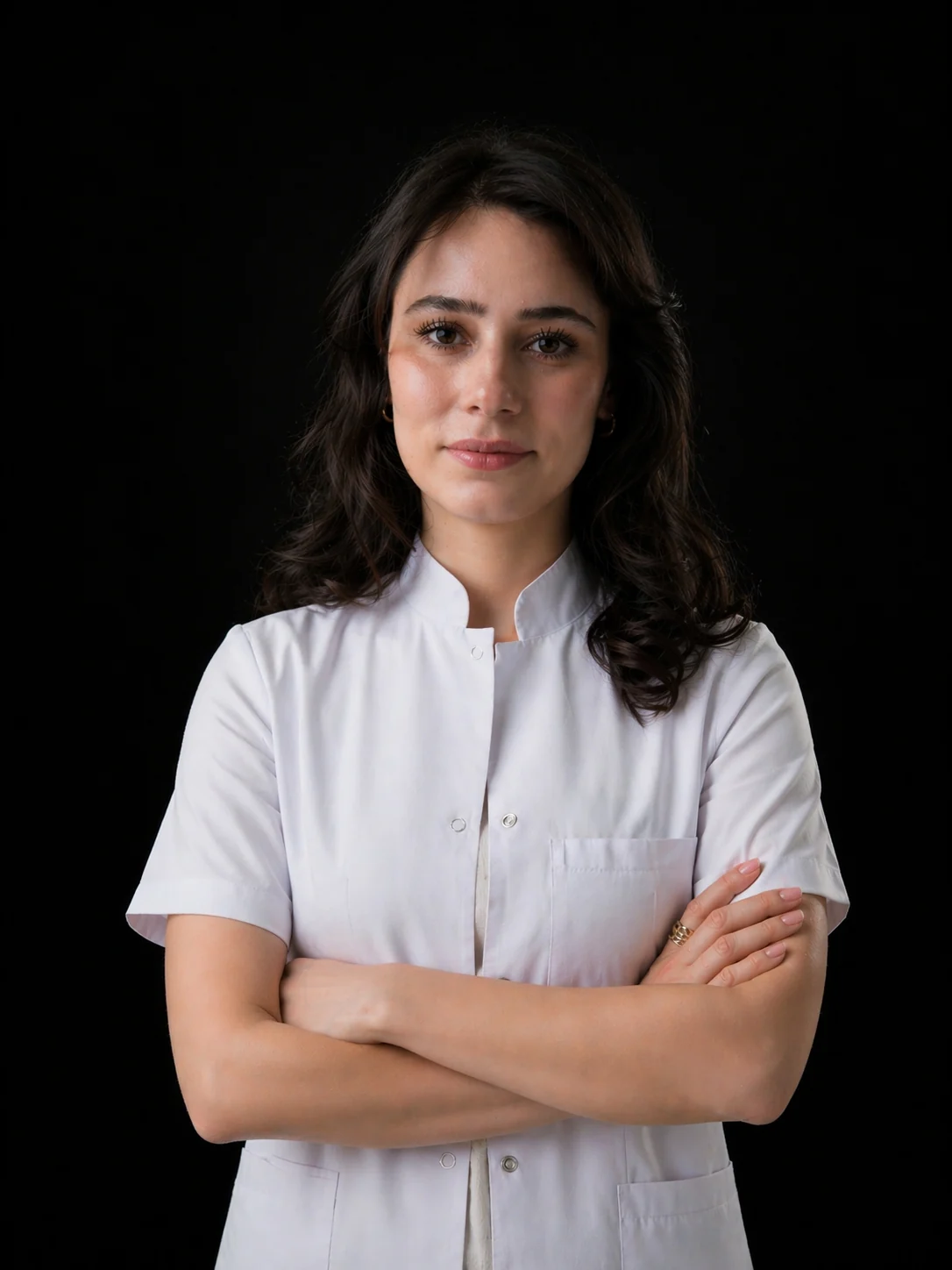
Studio portraits on a dark background, with expandable dentist profiles. Education, specialism and experience are one click away; patients know who they’ll be seeing before they sit in the chair.
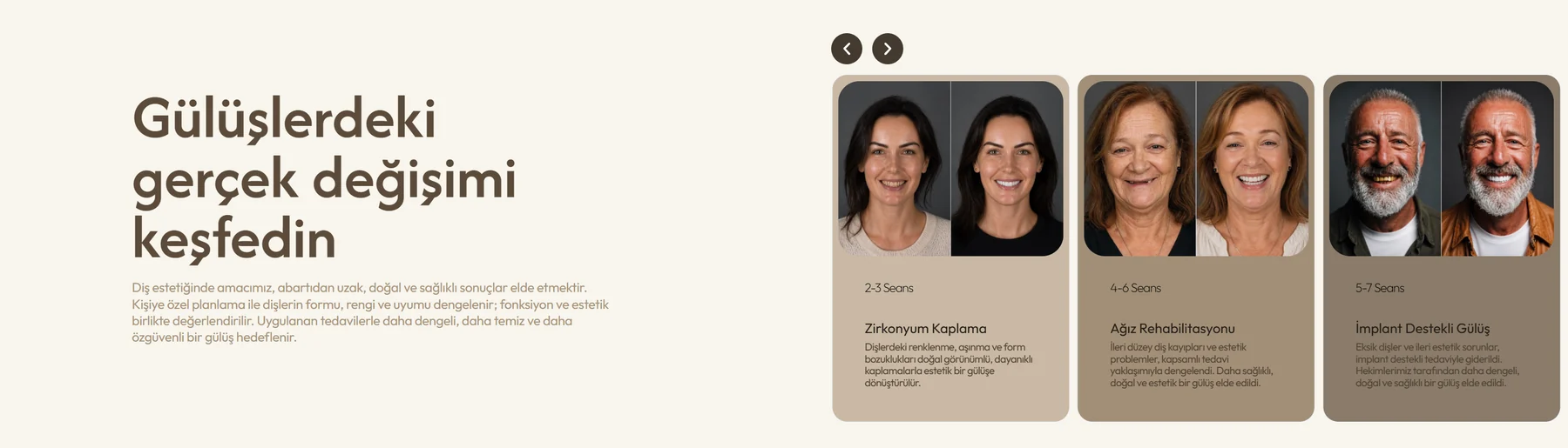
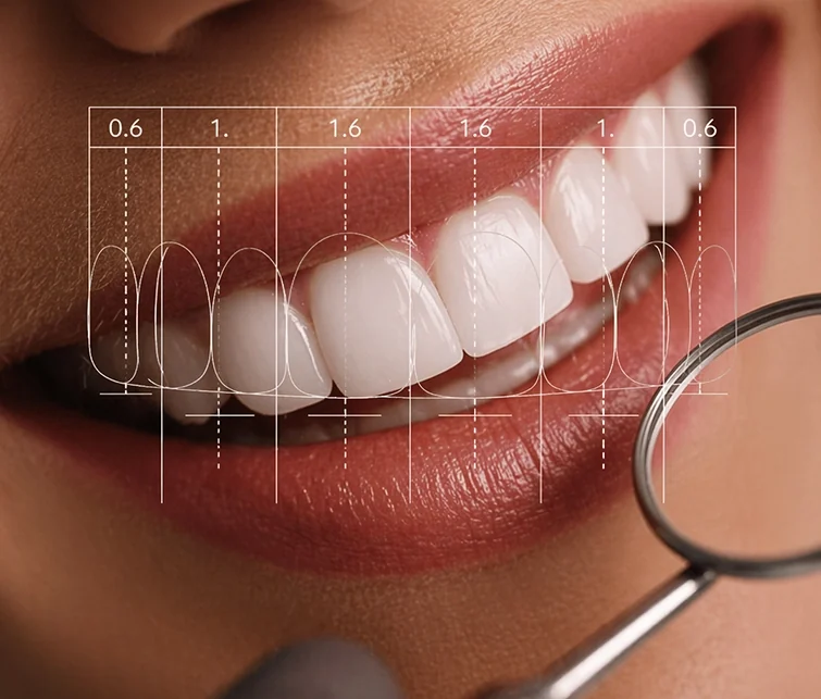
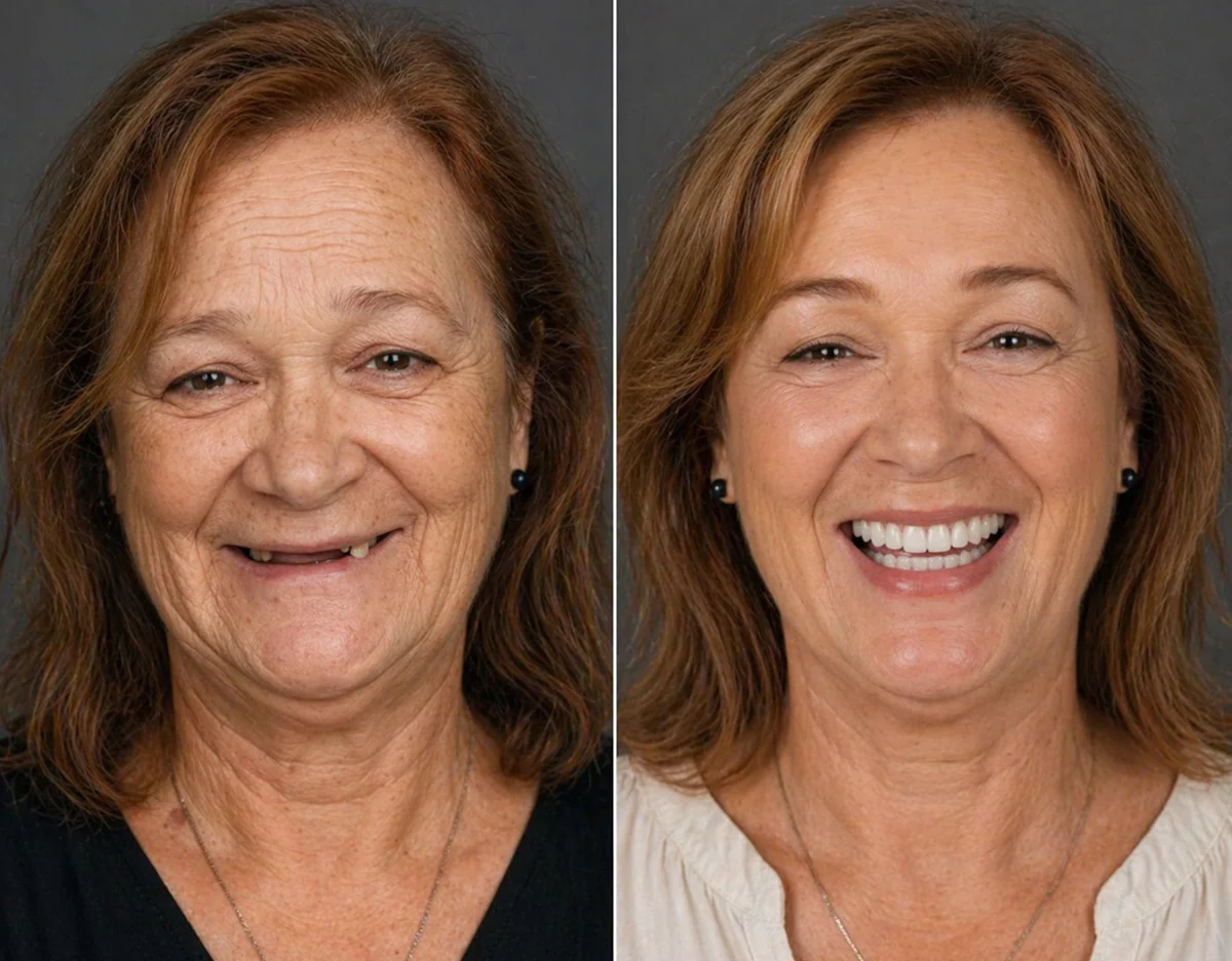
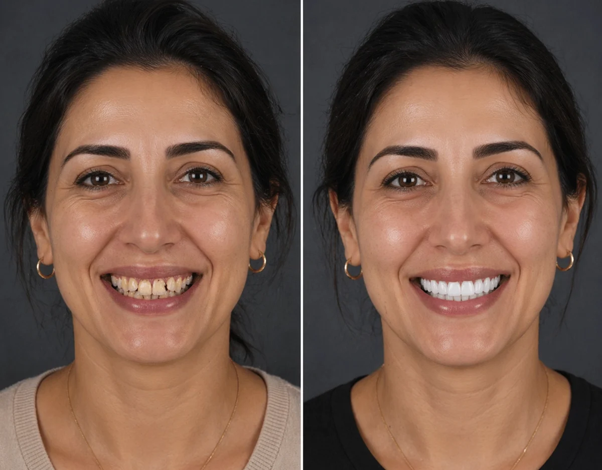
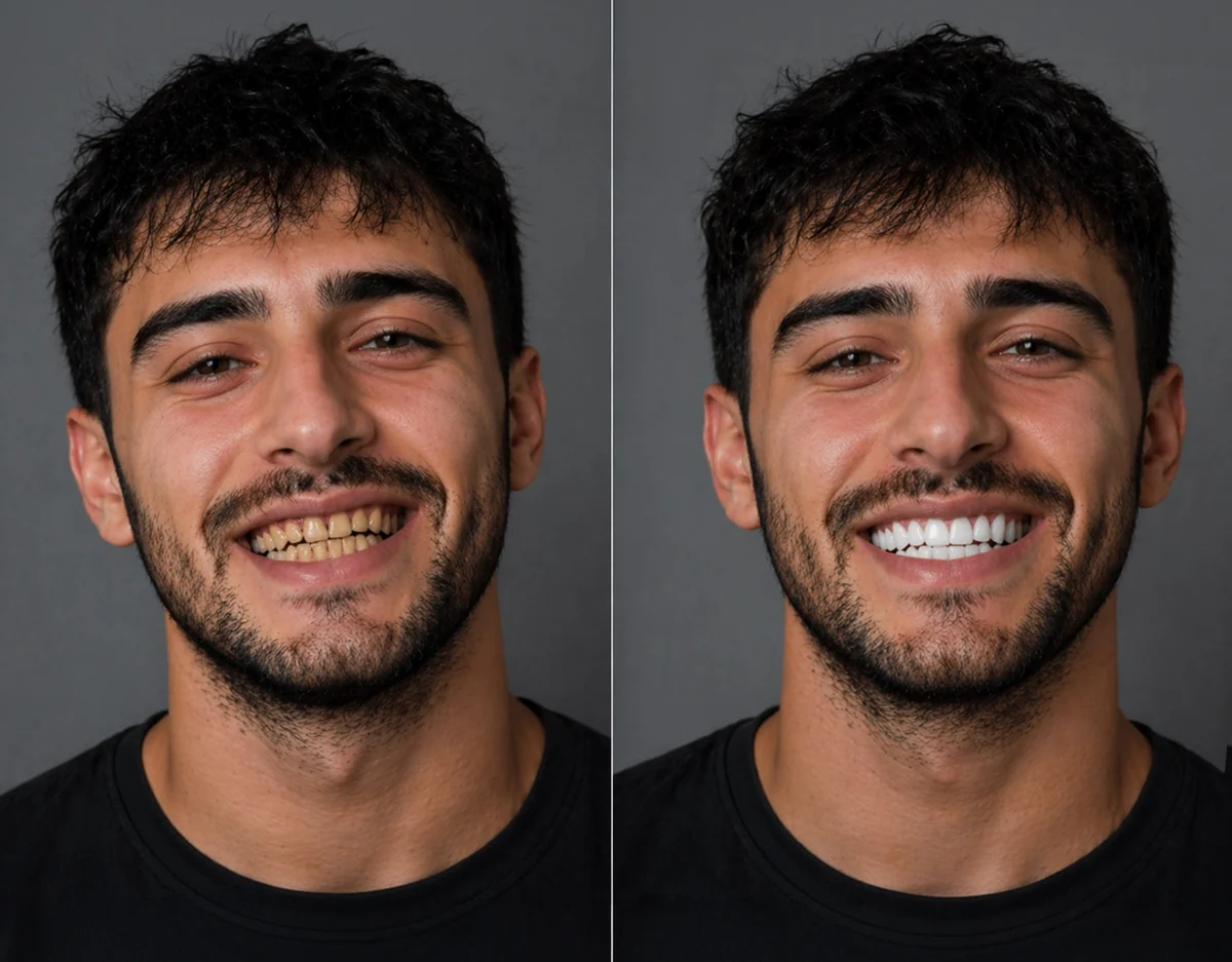
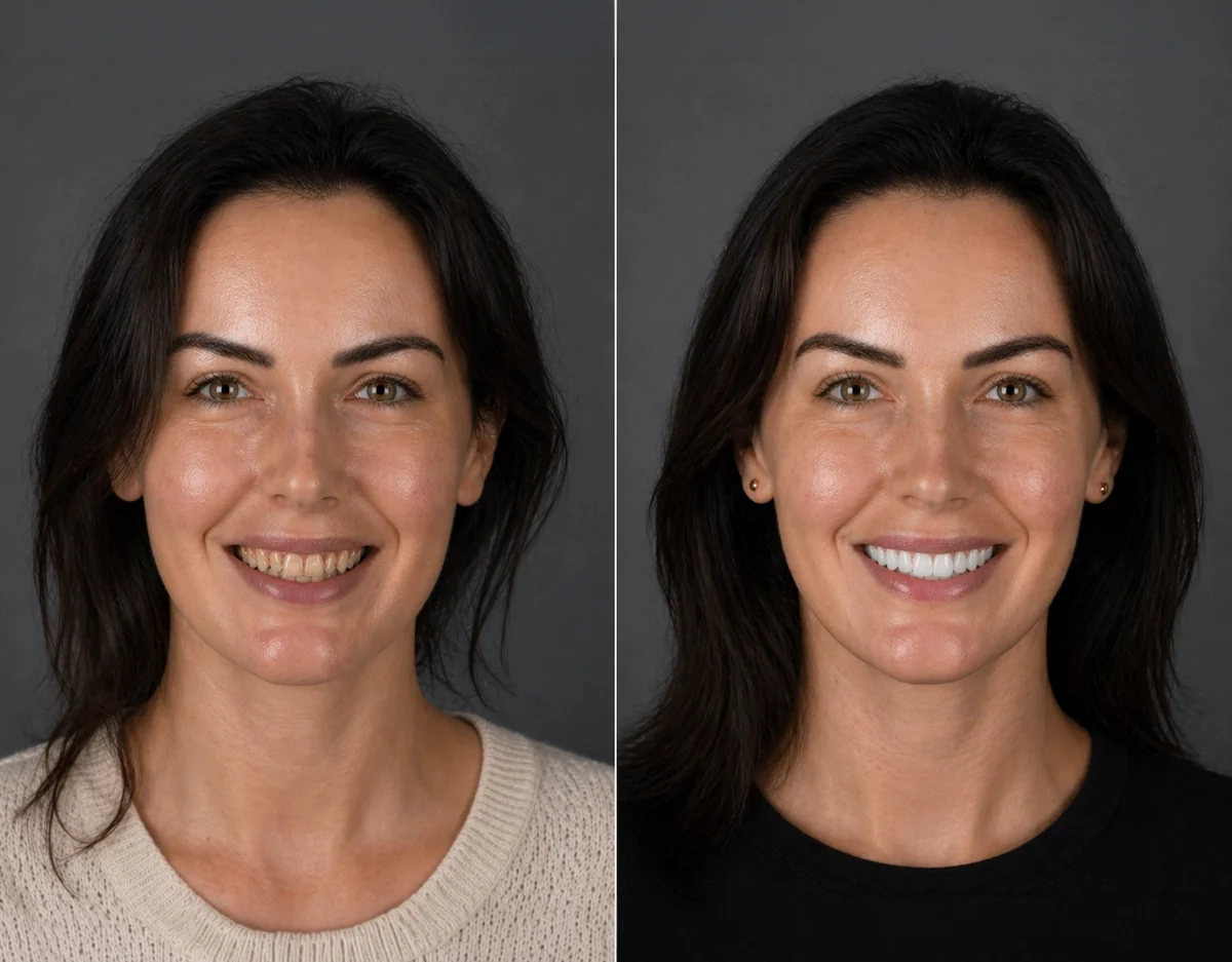
Swipeable before/after cards. They show what the treatment changed at a glance, instead of in long sentences.
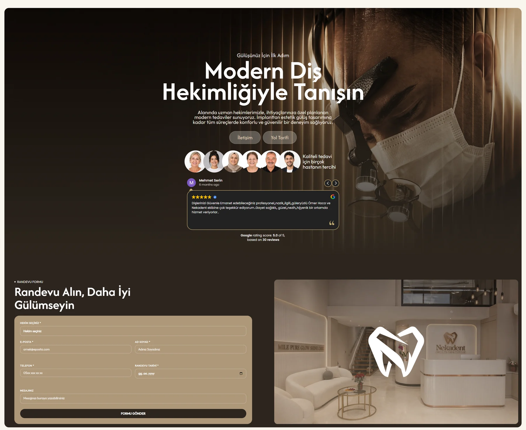
Google reviews stream live on the site, showing a 5.0 rating. Convinced visitors get an appointment form straight away: treatment, name, phone, date. Every submission is recorded in Google Ads as a conversion.
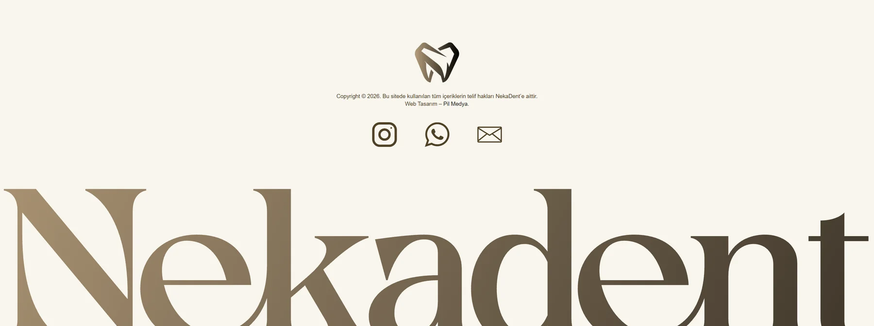
The page ends on a calm close, with the logotype set at giant scale. Phone, WhatsApp and email icons up front one last time.
The home page drives a quick decision; the About page deepens trust. This is where the dentists’ full CVs, the gallery of the space and the Instagram feed live.
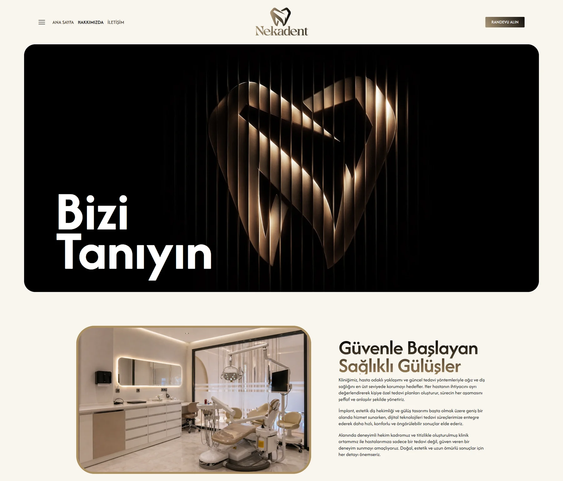
The page opens with an image that reinterprets the logo’s light lines. Below it: the clinic’s story and a bright treatment room.
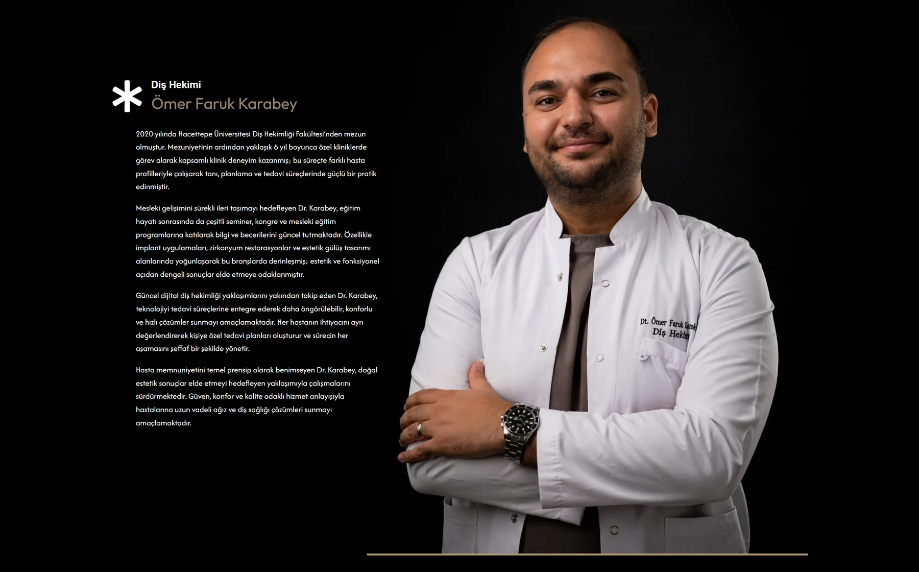
Separate sections for Dr. Ömer Faruk Karabey and Dr. Nisanur Yeşilçimen: education, areas of expertise and approach to care, with large portraits.
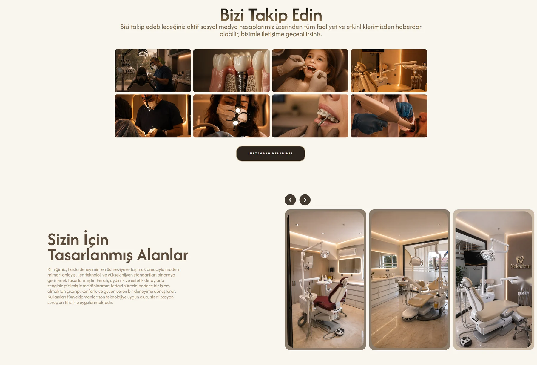
The Instagram feed and the “Spaces designed for you” gallery. Reception, waiting area and treatment rooms in a scrolling strip.
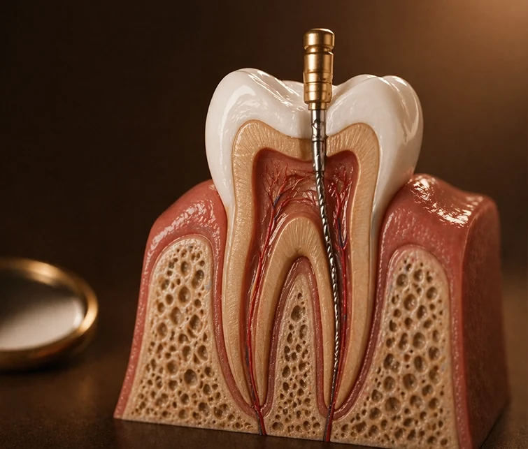
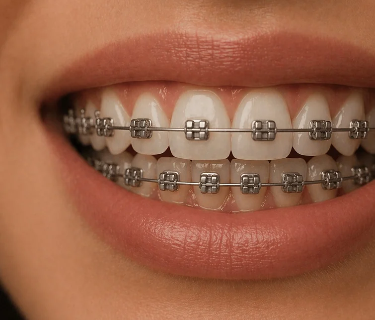
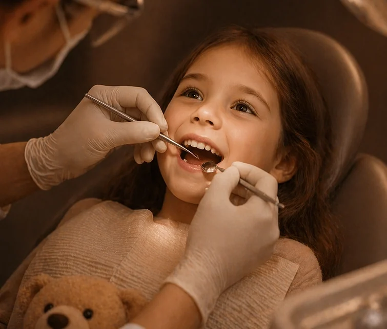
Not a single stock photo on the site. Service visuals, dentist portraits and before/after cards were each produced individually; light, colour and framing tuned one by one to the brand language.
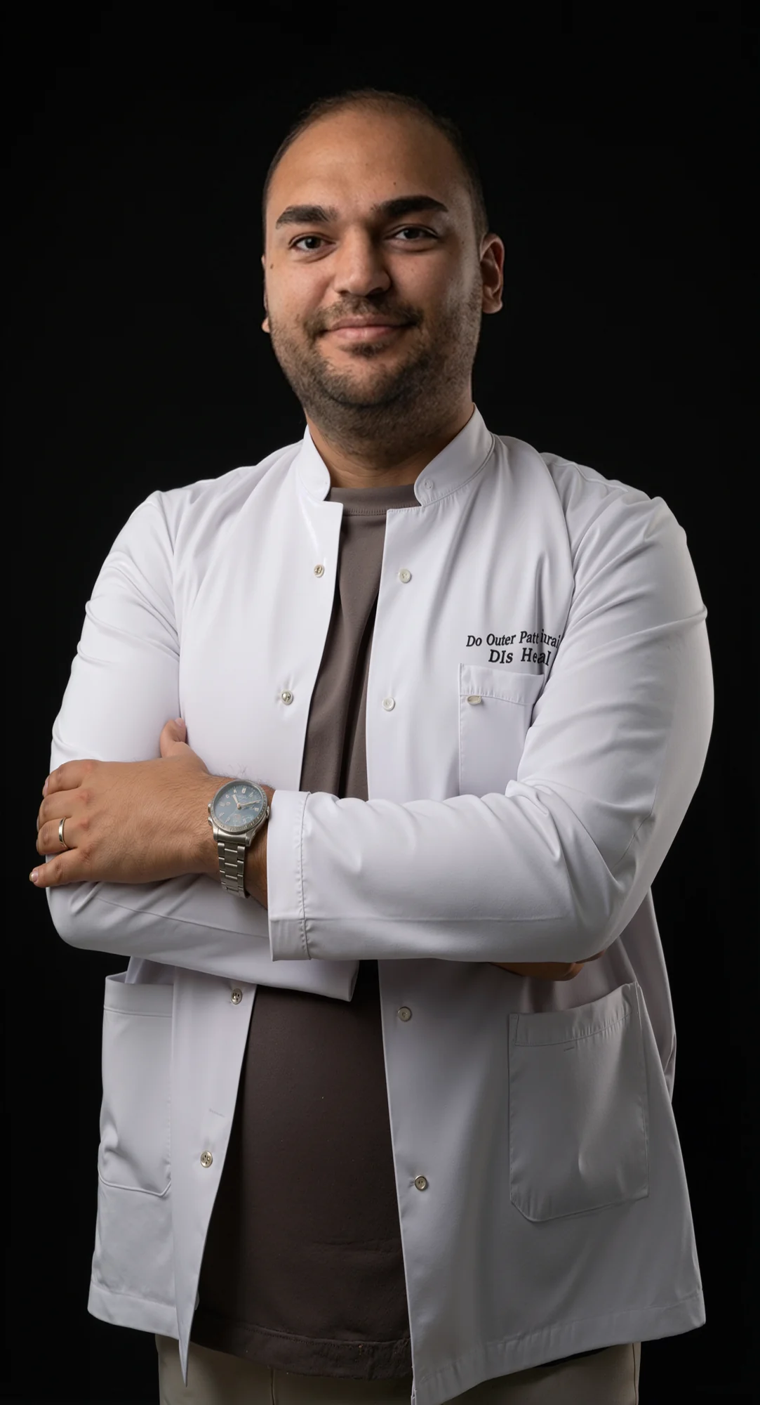
A shared portrait set used on dentist profiles, on Google and in ads. Logo-embroidered coats, arms folded, a confident yet warm stance.
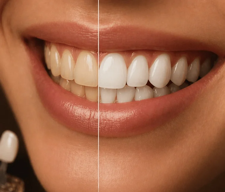
To protect patient privacy, we created representative images for the before/after section. Same light, same framing, same backdrop: the eye goes straight to the difference in the smile.
A booking button in the same spot on every screen: logo, dentist and a single action. Wherever visitors are on the page, an appointment is one tap away.
Most visitors arrive on their phones. On mobile: a single column, large tap targets, fixed WhatsApp and call buttons.
Real dentists, before/after cards and live Google reviews. The 5.0 rating shows right on the site.
Every call, WhatsApp click and form submission is tracked as a conversion in Google Ads. We know which ad brings in patients.
We spent a day at the clinic, shooting the space, the dentists and moments of treatment. Then we worked through every frame one by one: light, colour, perspective and clean-up of detail. The aim was not to change the photo, but to capture how the space really feels. The raw shot and the delivered version, side by side:
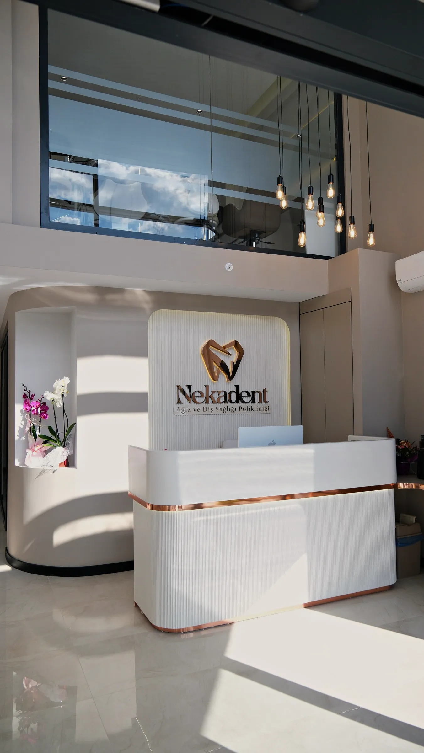 Raw footage
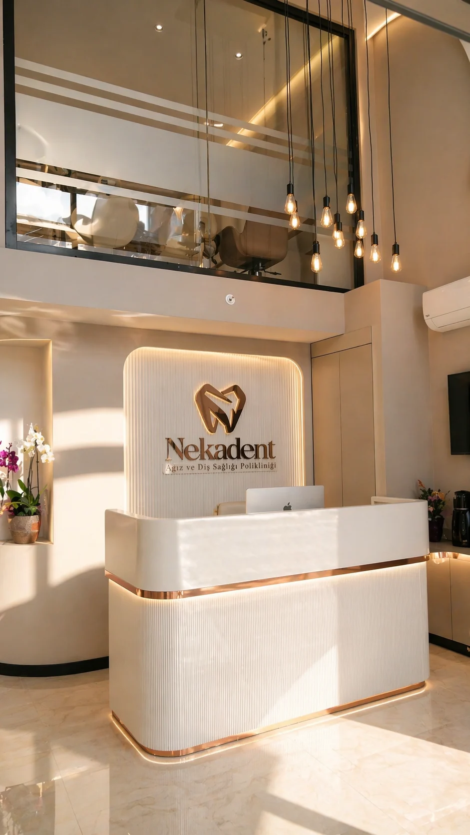 Delivered
Reception.Harsh daylight from the window was balanced; the illuminated logo panel and copper line were brought forward.
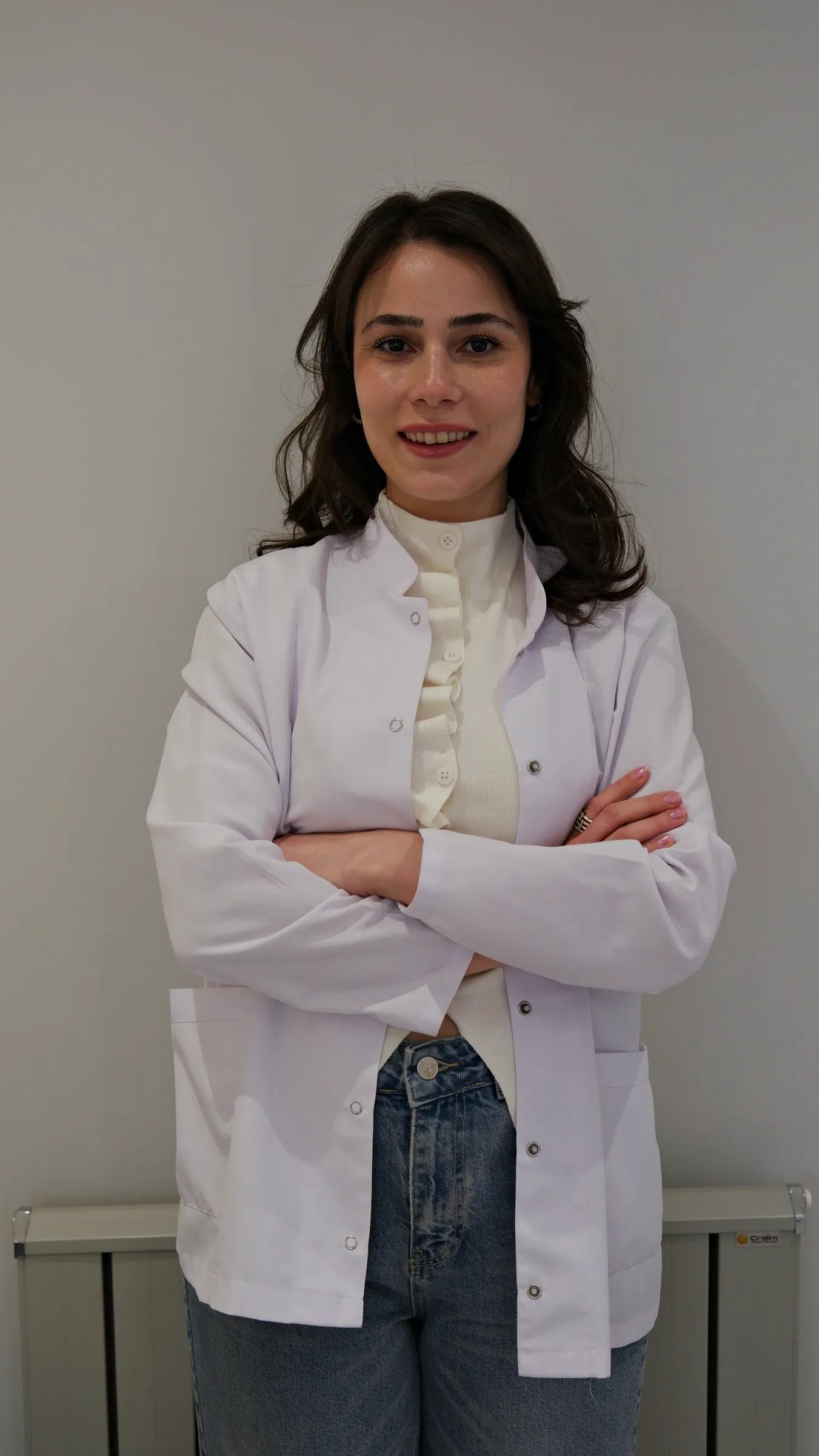 Raw footage
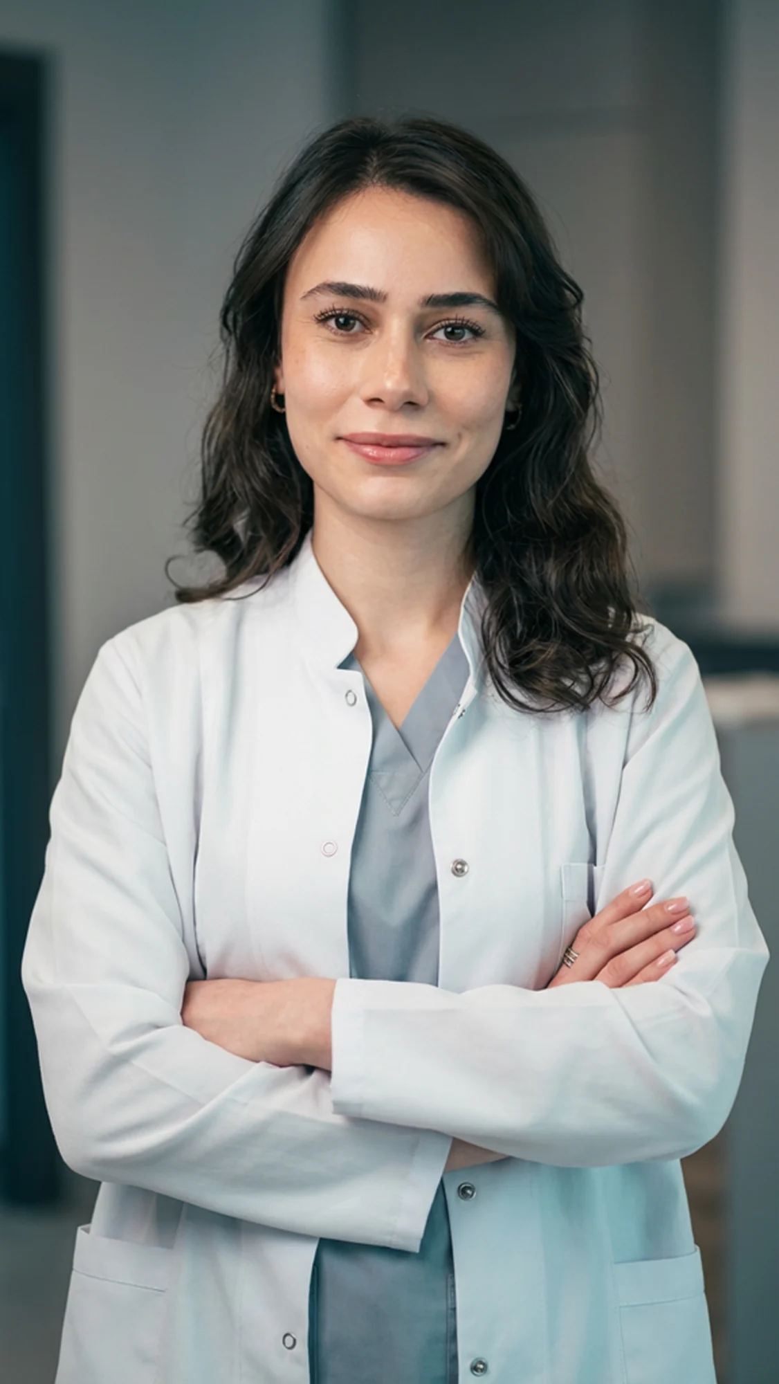 Delivered
Dr. Nisanur Yeşilçimen.Same pose, same person; backdrop, lighting and coat refined. Used as her profile photo.
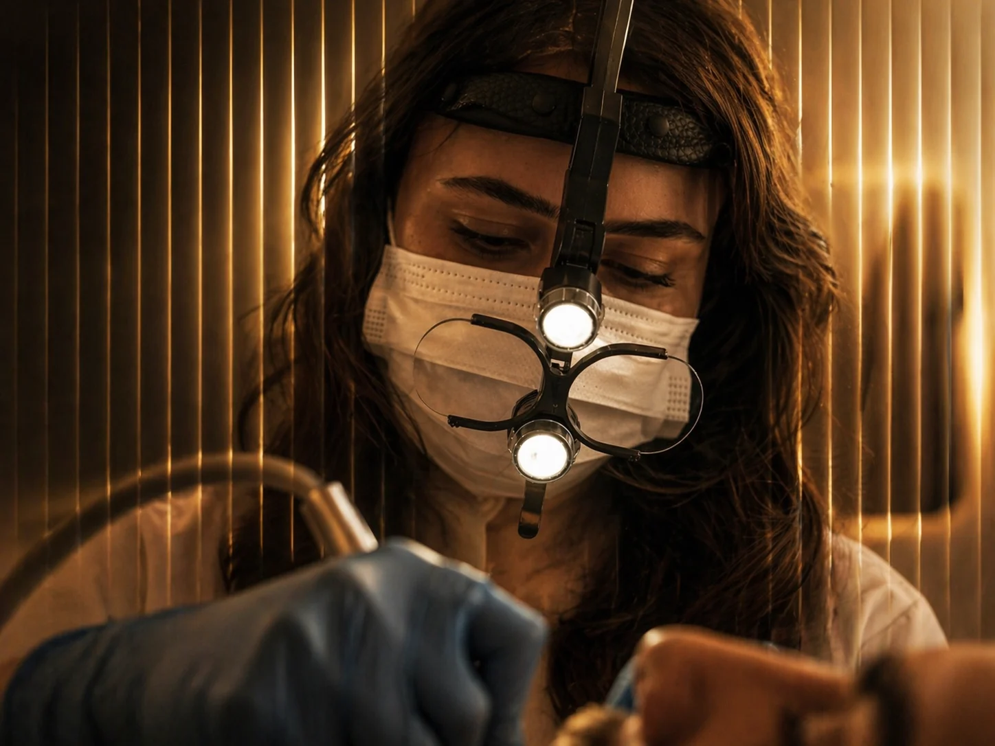
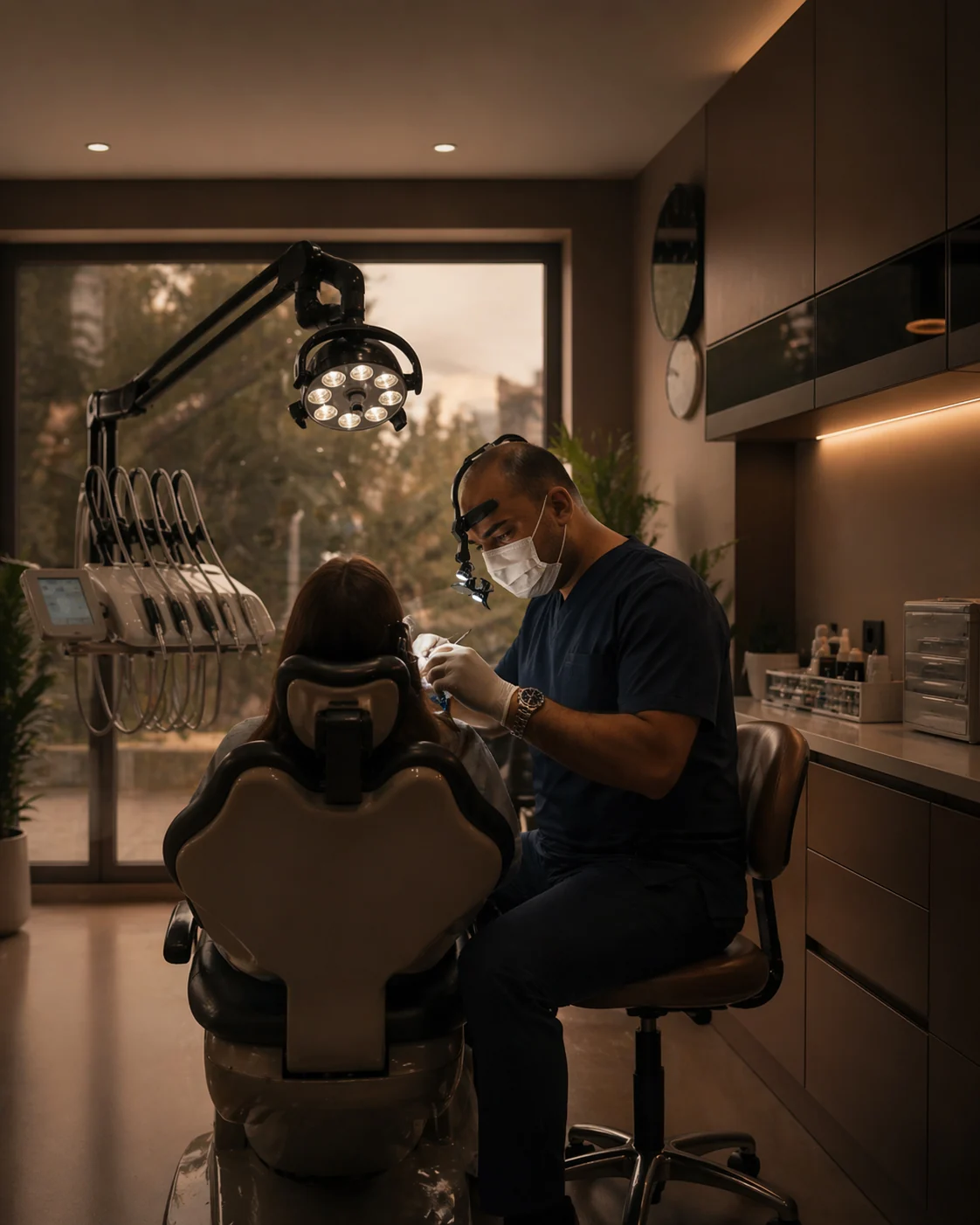
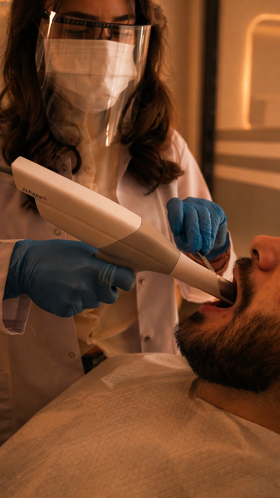
Loupes, light and gloves: warm, cinematic frames that show the treatment itself. Used on the website, the Google profile and in ads.
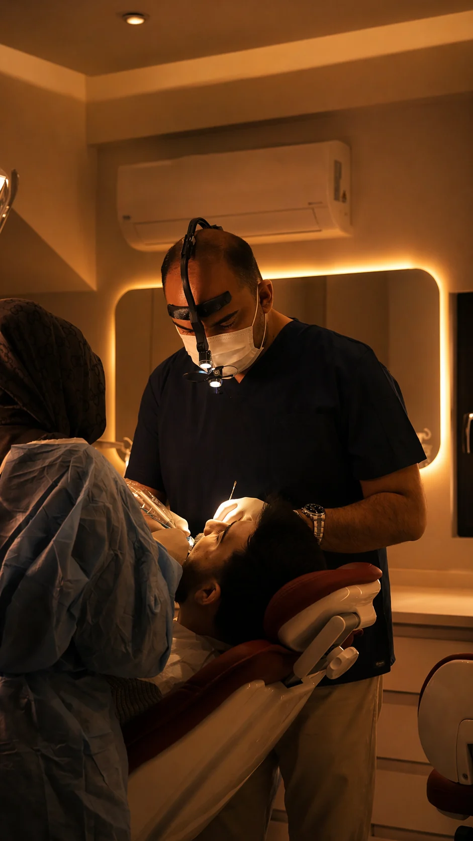
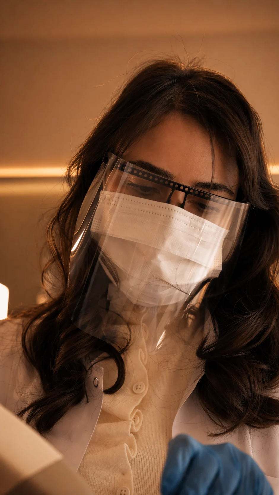
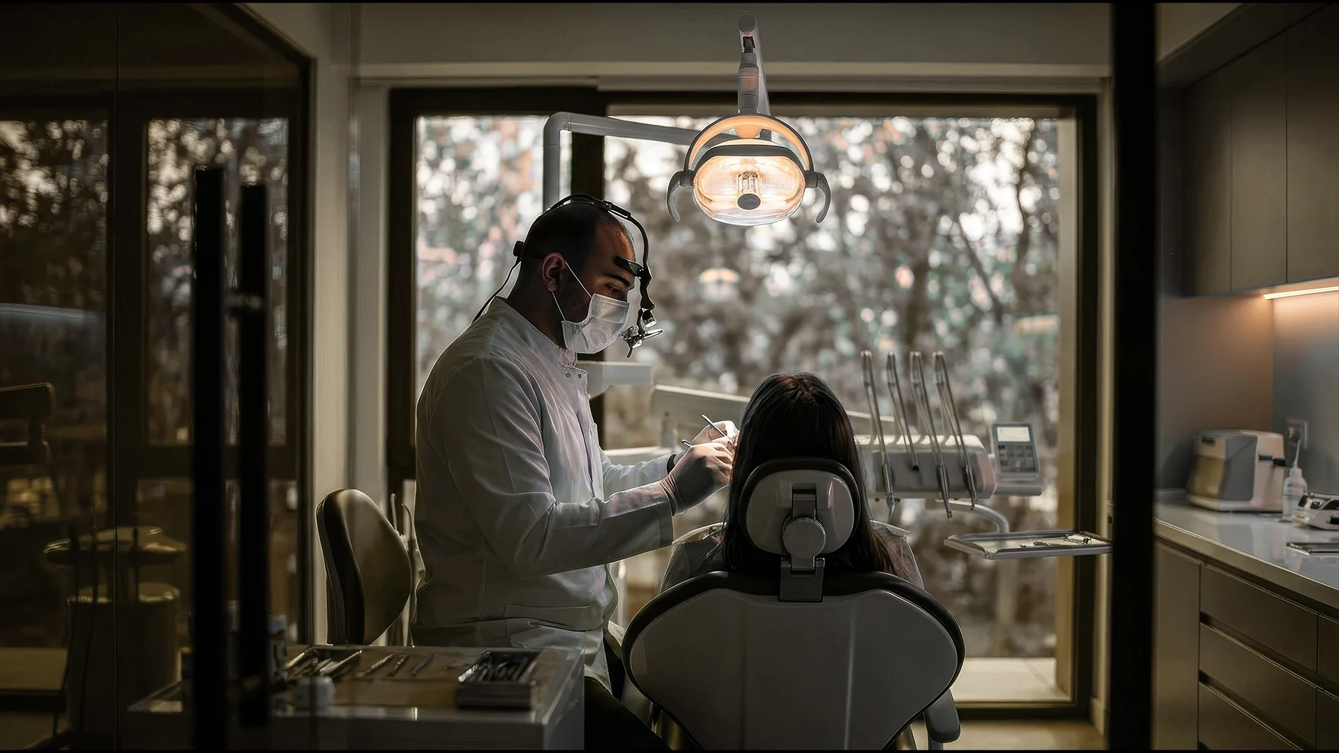
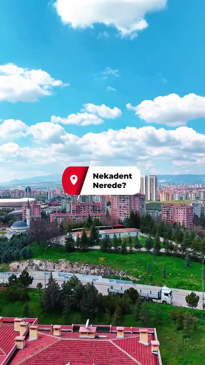
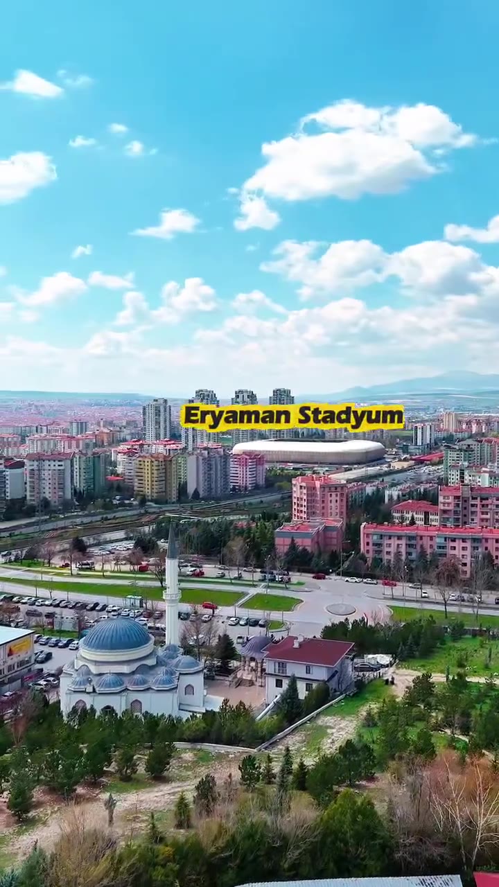
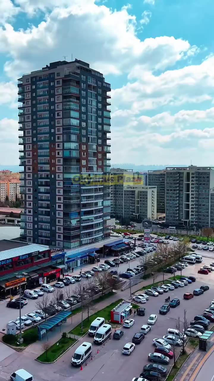
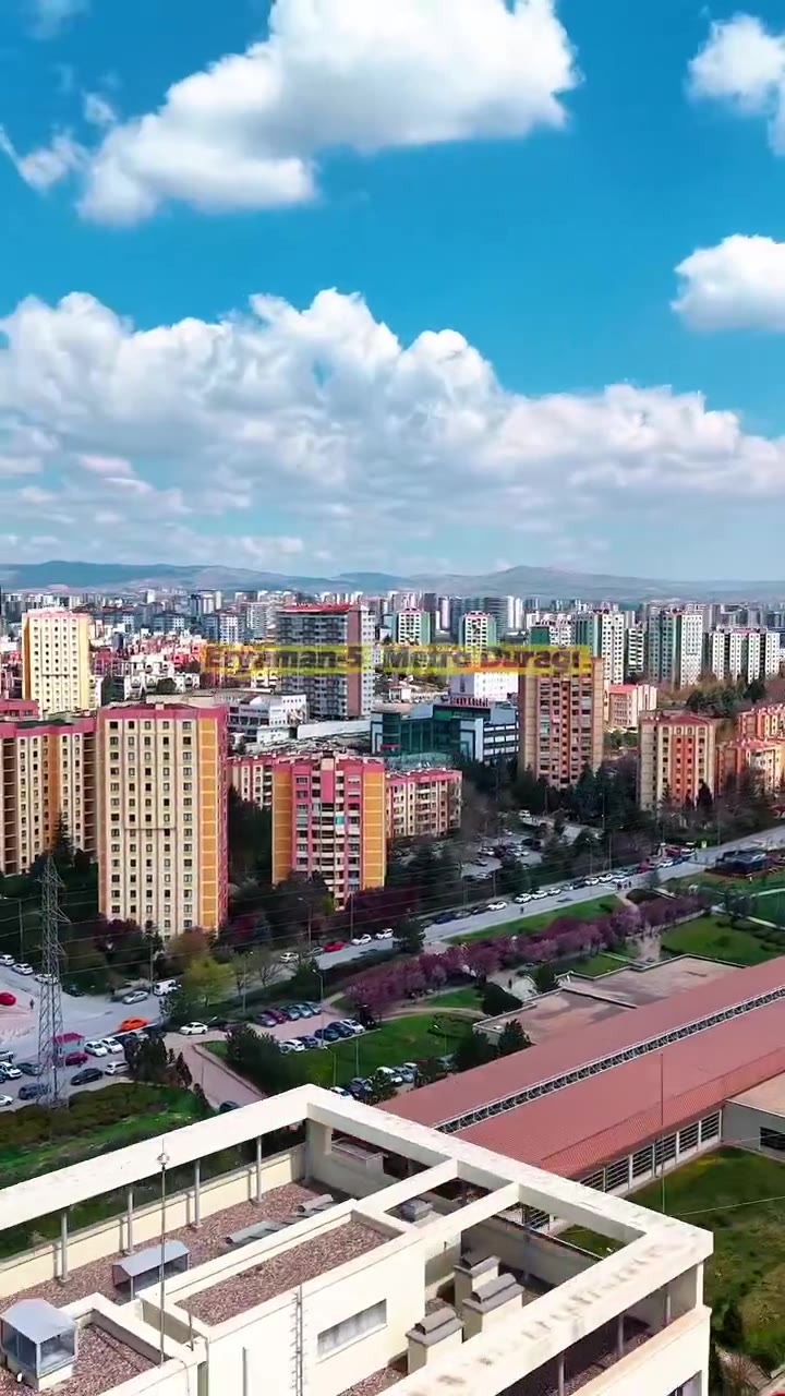
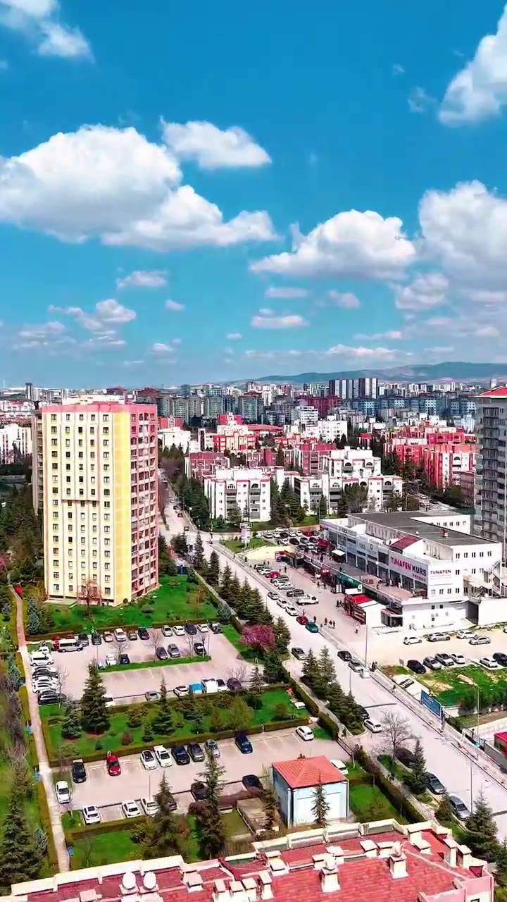
A new clinic’s first problem is being found. We filmed Eryaman from above, tagged landmarks everyone knows — the stadium, Okyanus Plaza and the Eryaman-5 metro station — and brought patients right to the door. Then we stepped inside and toured reception, the waiting area and three treatment rooms in a single flow.
“Where is Nekadent?” A location pin and a wide shot of Eryaman.
Eryaman Stadium, Okyanus Plaza, Eryaman-5 metro station. Every point is labelled on screen.
The drone descends to the facade; facade and entrance in a single shot.
Double-height reception, the “Smile · Pure · Glow” wall and the waiting area.
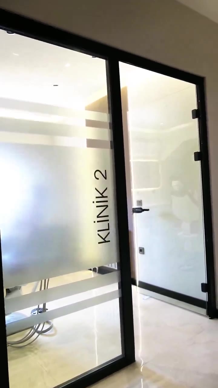
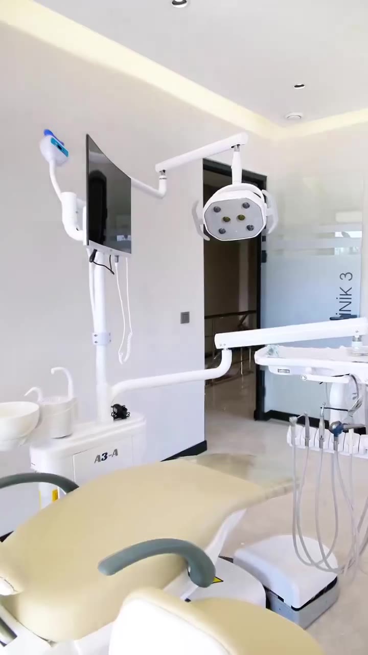
Glass doors, dental units and light. Patients have seen the room before they book.
Illuminated logo and closing.
Patients choose the dentist, not the clinic. We introduced each dentist with a short reel in which they explain their own specialty in their own words: Dr. Ömer Faruk Karabey on implants and prosthetics, Dr. Nisanur Yeşilçimen on aesthetics and smile design. We did the photo shoot the same day and shared the behind-the-scenes too.
Most patients see Nekadent for the first time on Maps. So we built the profile like a shop window: dedicated images for the space, the dentists and the treatments, regular posts and a reply to every review.
The Google Ads data made it clear: most patients come from direction requests. The profile is kept complete and up to date to meet that traffic.
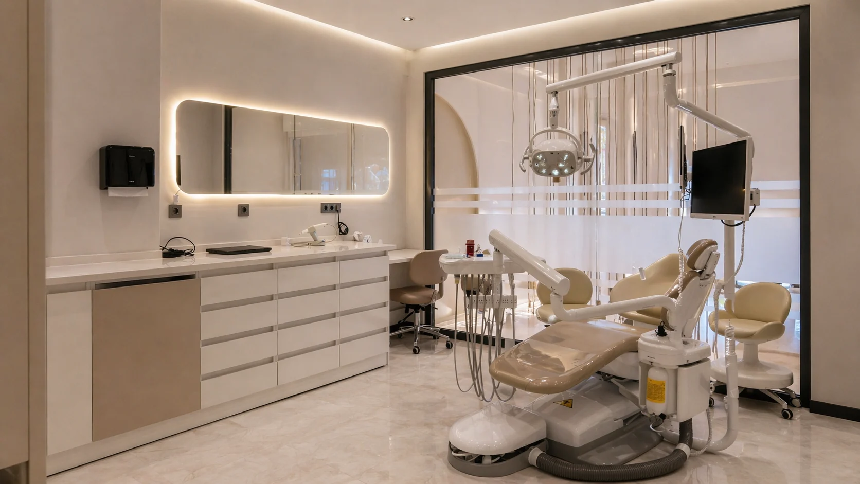
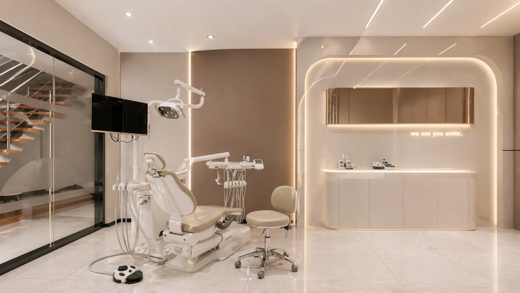
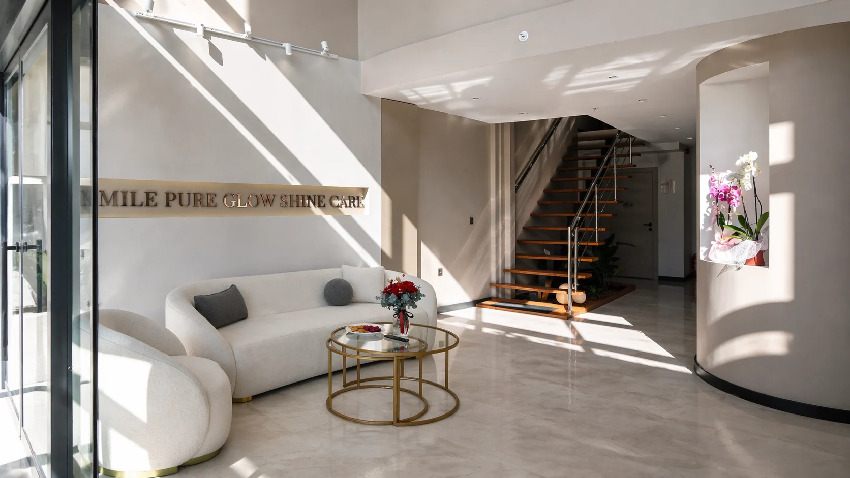
Interior shots uploaded to the business profile. Before asking for directions, patients see the reception, waiting area and treatment rooms.
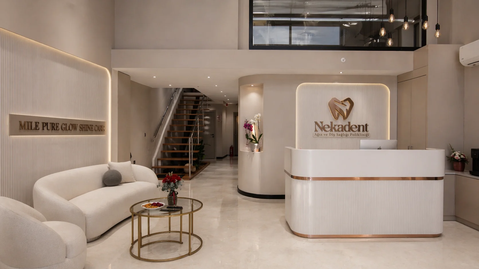
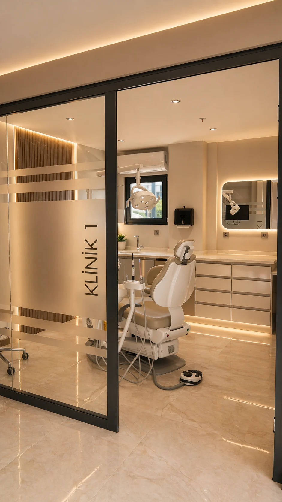
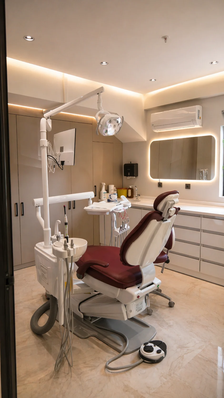
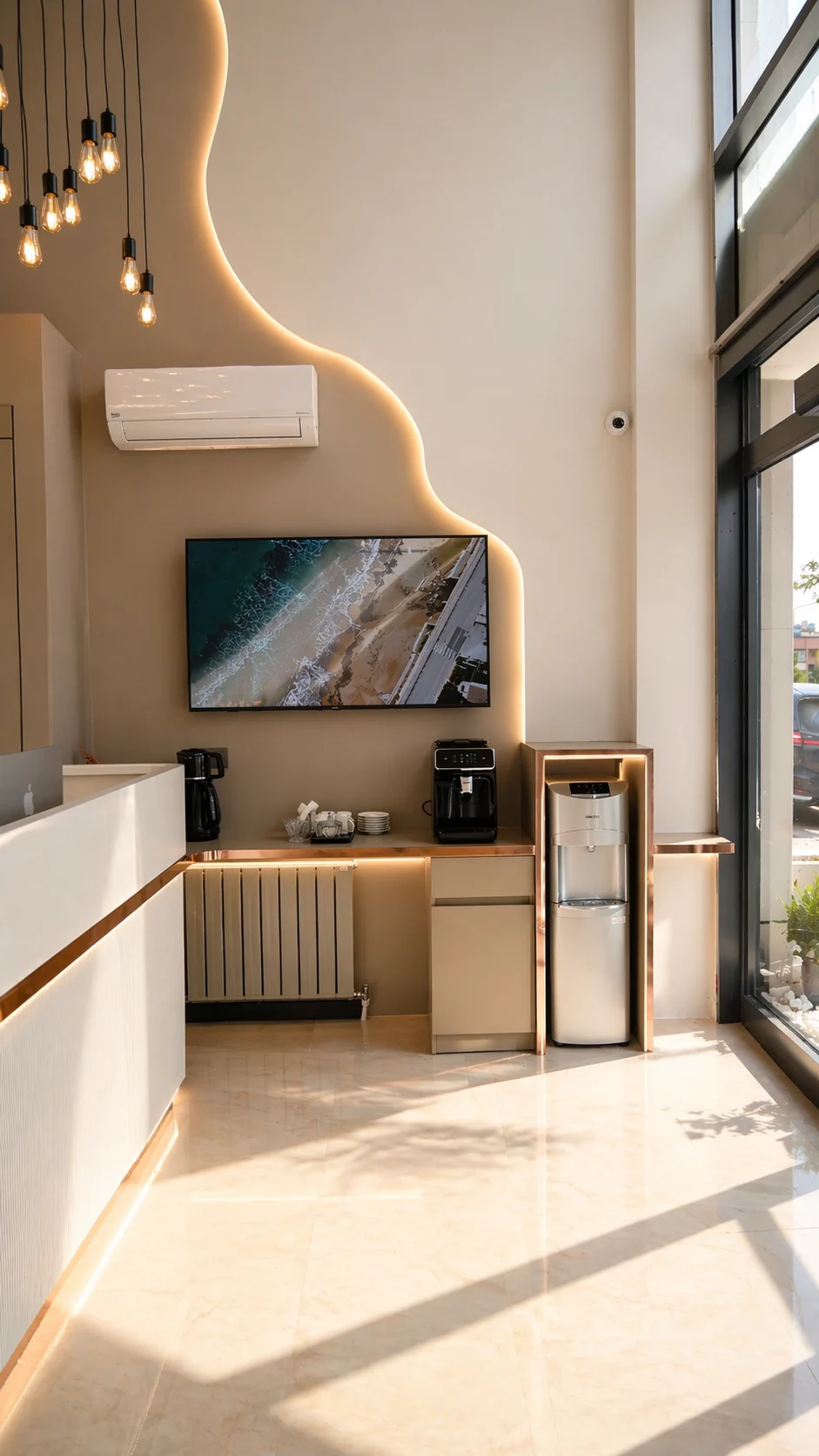
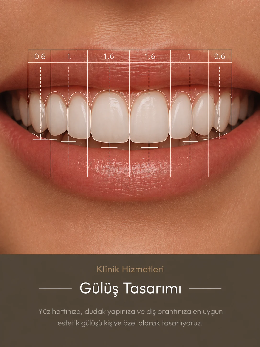
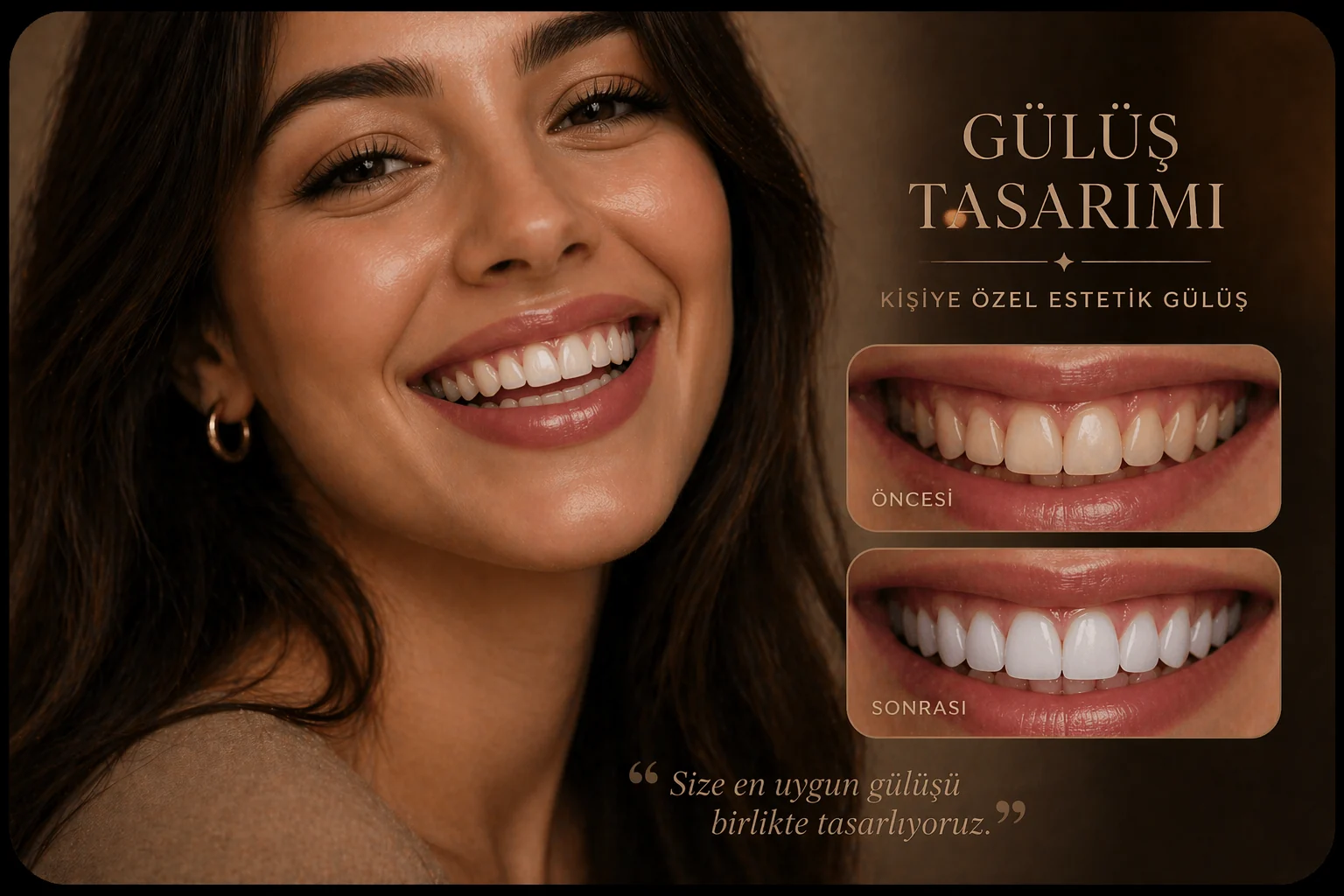
Service posts published on the profile and social media. Logo, colour and typography exactly match the website.
The clinic opened in April. For the first two months the search campaign brought in expensive clicks; feedback from the dentist showed us that real patients were coming from Google Maps. We shifted the budget there. The results are below, straight from the ad account.
Phone calls, WhatsApp and direction requests. White line: cost per contact (May = 100).
Source: Nekadent Google Ads account · April – August 2026
The search network was bringing in expensive, scattered clicks; we shifted the budget to Maps and Performance Max.
Business profile, conversion tracking (calls, WhatsApp, directions) and the first PMax test.
District + treatment keywords. Plenty of clicks, costly patients: cost per contact at its peak.
Search was scaled back and Maps and PMax took more weight. Direction requests passed 1,000 in the first month.
1,845 contacts a month. Cost per contact fell to 14% of May’s.
We manage the account with weekly search term clean-ups and location settings.